Dev blog
[p align="start"]Hello everyone! As promised last blog, today I'll be talking about the UI rework. So first of all, why prioritize the UI as the first priority post EA release, especially when it's already a functioning part of the game?
Well, the UI is the first thing people see when loading up the game. First impressions are a big deal. Many players don't care about looks in a genre like this one, but many others do. If the Swarm is ever to grow, it must have an excellent UI foundation.
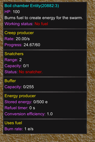
So what's wrong with the old UI? Well, multiple things... And it goes deeper than just 'looks amateurish or bad'. I've been reading about what makes a good UI good, and there's a whole science behind it. The Swarm's UI had bad spacing, sizing and emphasis was all over the place. For example, the colors of the old UI were orange, cyan, yellow, magenta and white. They're all too prominent, which makes many details demand attention at the same time and that shouldn't be the case. The best example of this is the fixed tooltip. The purple labels attract more attention than the white values or even yellow titles.
To be clear, colors are not the only problem. Another thing I've learned about was hierarchy and clearer sections and headings. One very good example is the crafting categories tab in the Crafting window. I've watched several people play on Youtube for the first time and a few of them didn't realize that they could click on those tabs, or didn't even realize they were there as they were not catchy enough to the good ol' eyeball. It took them a bit of experimenting for that to click in, and that shouldn't be required if the UI was better designed.

There are of course other things that were not so well designed, but let's move on and look at some of the new UI and talk themes. My first thought was to make something with shades of purple and gold/orange, kind of like the wiki (You can check it out here Official Swarmdustry Wiki). So I tried a few implementations but to be honest, looking at all that purple and then seeing the Swarm also being mostly purple was just... too much purple. After quite a bit of experimenting with different color sets, I think shades of gray with gold hints might be the way to go. Here's how the new tooltip and crafting window look like:

Still debating if that progress bar for creep is useful or not.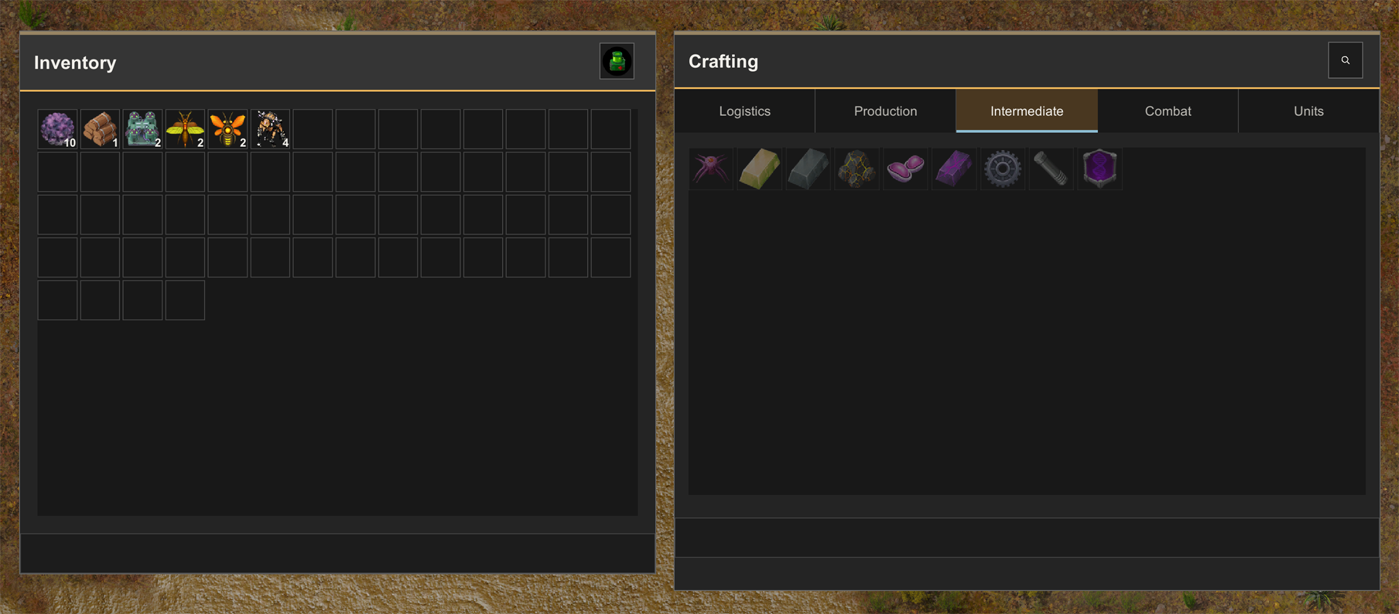
And the world generation menu:
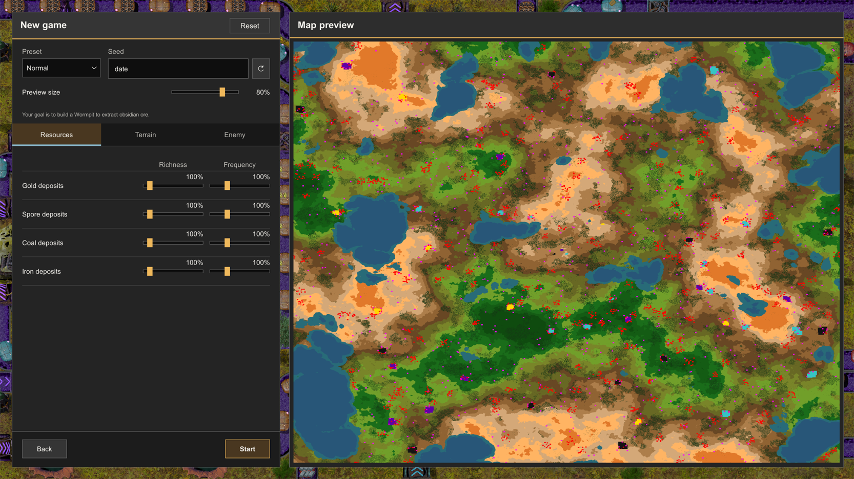
The UI is still not fully finalized yet, there will still be a few more adjustments here and there. For example, I plan on adding a button to enable/disable the preview of the map. By default it will be disabled. Also don't mind the pink spots on the map, that's part of another work in progress...
So anyway, I hope you guys like the new look! Until next time!
[p align="start"]The swarm must grow.