Hello, friends!
We can see that many of you are interested in how our development process was organized, particularly our work on the game's illustrations. How did we develop the characters' appearances and visual solutions for individual scenes? What guided us during the process, and when did we know it was time to stop? What challenges did we face, and what mistakes did we make in our workflow?
You can read all about it in our new article.

The core principles behind our work on the game's visuals:
The interface design and illustrations form a single visual and gameplay space. Its purpose is to help the player immerse themselves in the game world.
The illustrations should create a unified sensory space with the text and sound, helping the player experience the intended emotion of the scene. They are a means of enhancing the immersion and expressiveness of a particular artistic episode.
We aimed to create as many illustrations as possible so that key episodes and important scenes would feature original artwork. To achieve this, we had to limit the number of revision rounds for each illustration: once it fulfilled its primary artistic purpose, we moved on to the next one.
In practice, this meant that we rarely allowed ourselves to create images illustrating only one specific scene. The game contains around 350 illustrations, and almost every one appears in several scenes. Our task was therefore to turn each piece into a kind of symbol that would remain appropriate in different contexts. This also meant that we focused primarily on the focal object, deliberately leaving the background less detailed.
Below, we will tell the stories behind several of our pieces to show through specific examples how this approach worked in practice.
Characters and Faces
One of the most important aspects of our deeply personal story is the humans and Arknians close to the prince, as well as Jerian himself. We spent a long time developing each character's appearance and searching for the right face, pose, and gesture, knowing that the same illustration would be used in many episodes featuring entirely different events. At the same time, it had to remain appropriate and support the scene in every one of them.
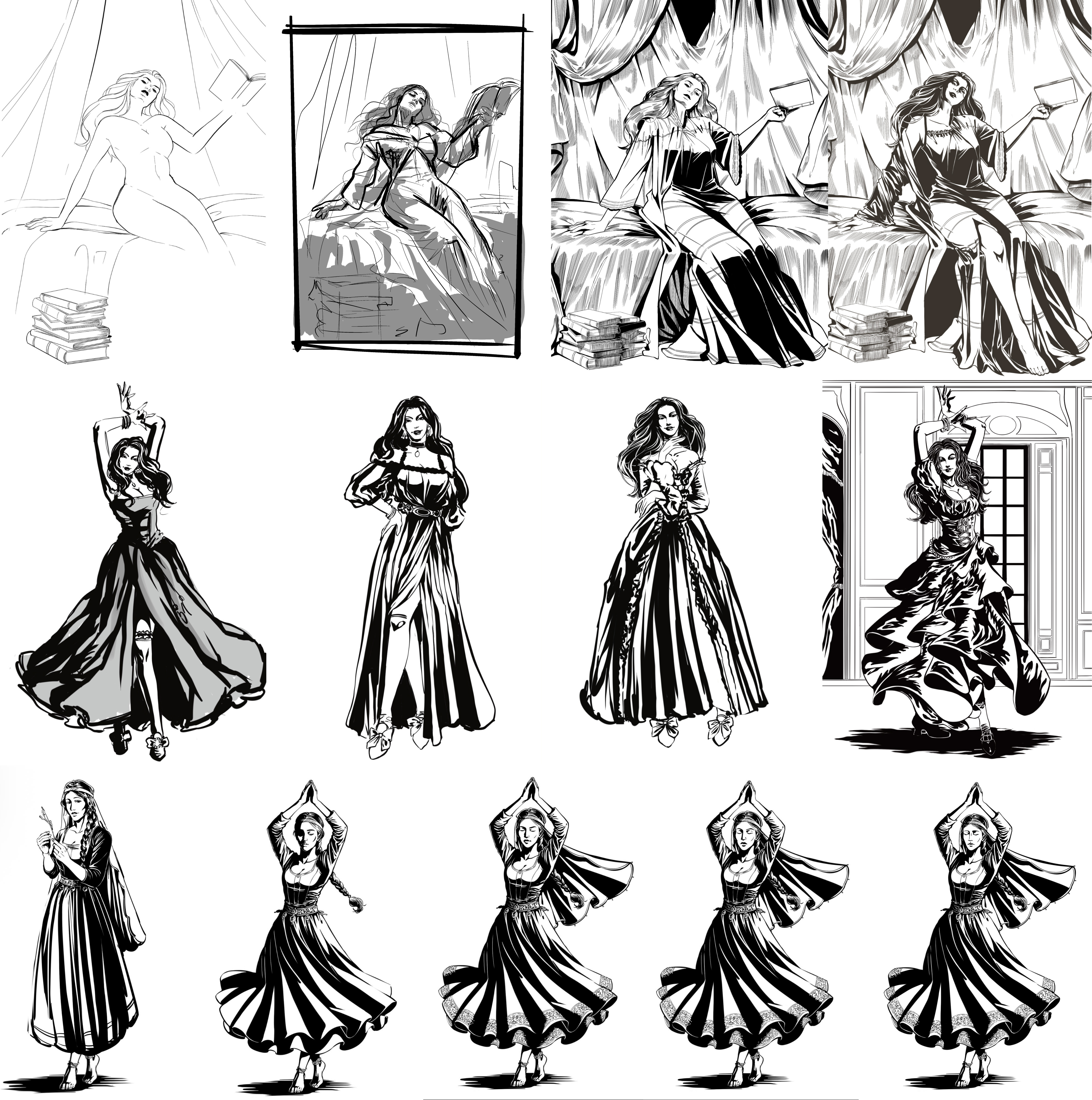
Agatha
One of the characters we love most—and one of the most challenging for us—was Agatha. As we worked on the game, we came to understand her personality and inner world better, and her appearance gradually changed along with our understanding.
Jerian
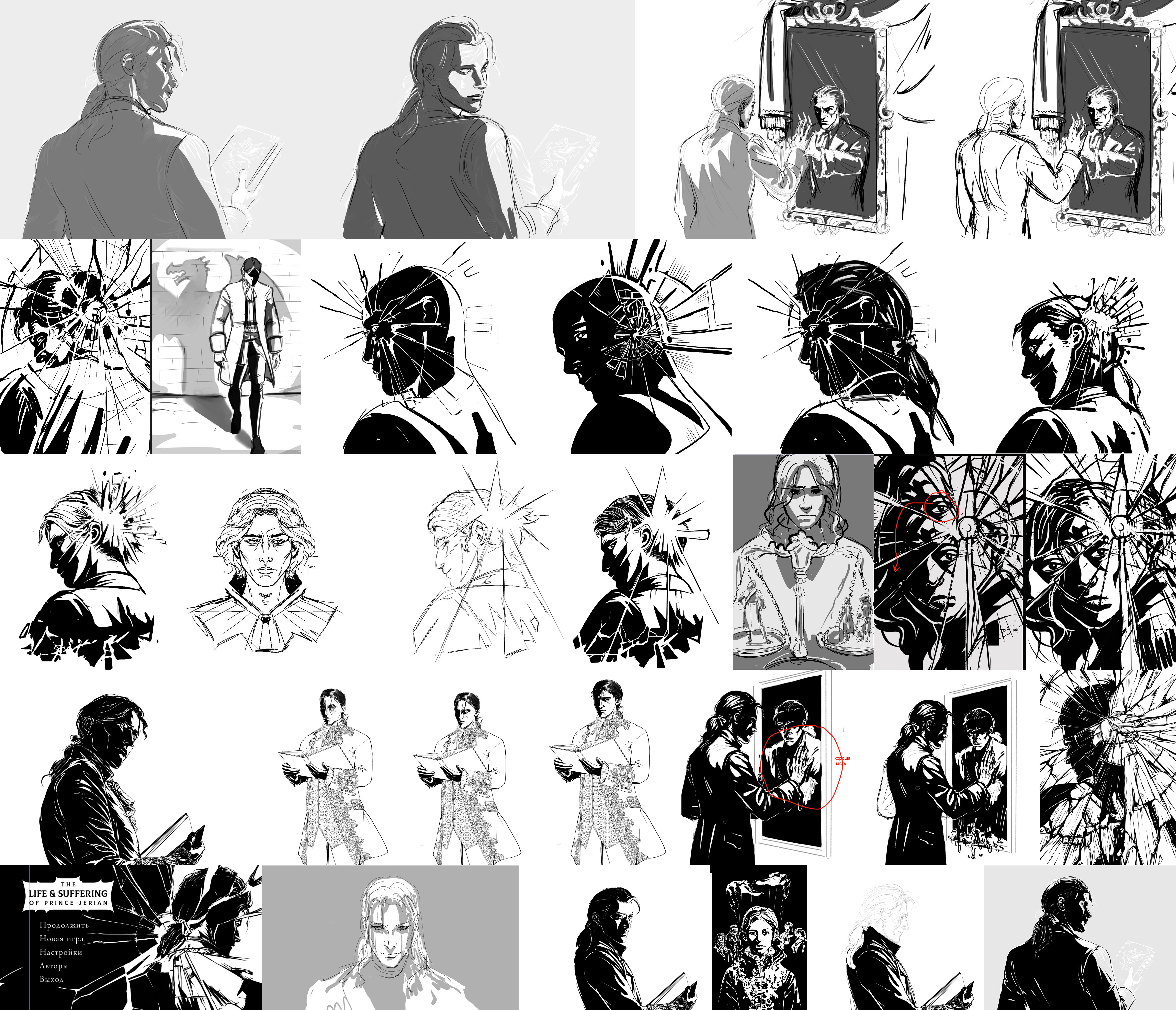
Finding the prince's own face was an even more difficult and contentious process. We tried to strike a balance between a fully visible face—after all, unlike Sir Brante, he is known throughout the Empire—and the character's inner conflict and duality. That is why it took us so long to find both the right angle and the right features for Jerian.
Ultimately, we settled on a principle: whenever we show the prince, his face should be visible but always remain in shadow. We wanted players to be able to imagine the nuances of his emotions for themselves, becoming co-authors of sorts. That is why we gradually reworked all the early artwork, immersing his face in shadow.
Gaius Tempest
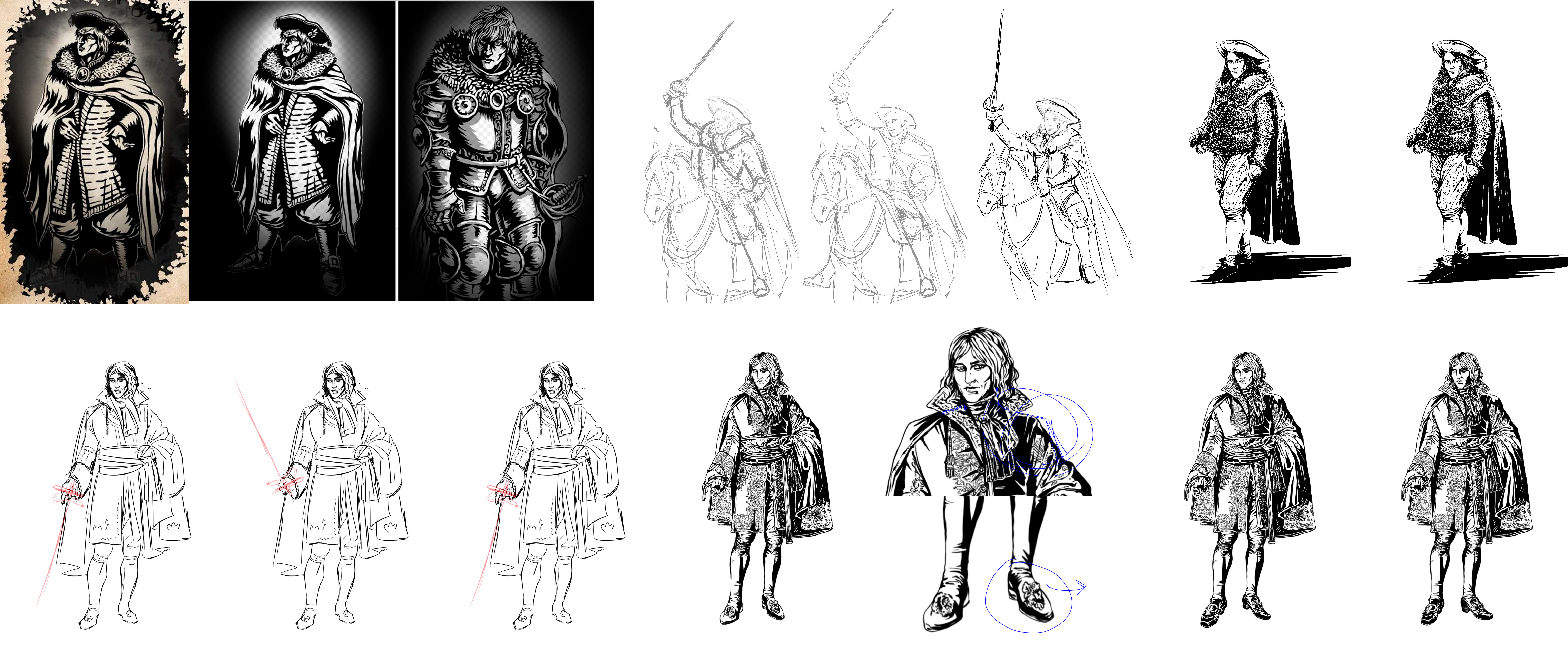
Gaius Tempest clearly illustrates just how long it took us to understand how our characters should be presented in general. Should their appearance, surroundings, and visual details convey their inner essence, even if that contradicted the circumstances of a particular scene?
Eventually, we realized that this approach would not work and moved toward more versatile depictions of the characters. For Gaius Tempest, this meant abandoning the idea of depicting him on horseback or in armor: it would be difficult to imagine such an image appearing, for example, in the palace, where he may also be encountered.
Ovidius Lucullus
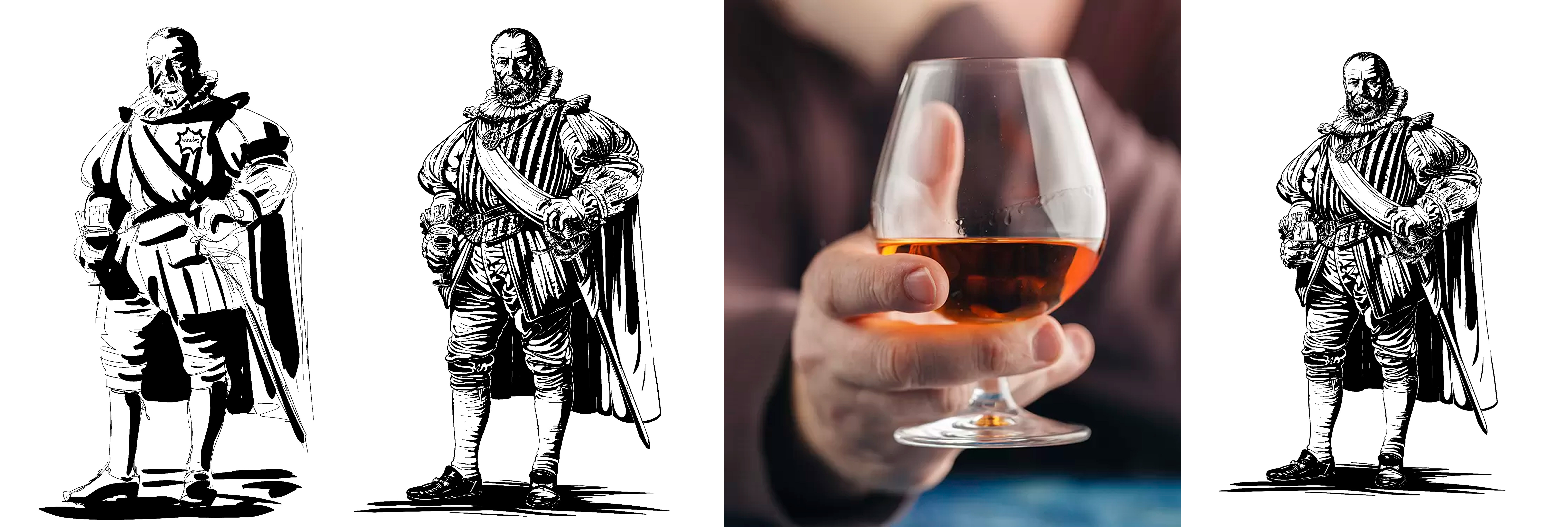
Sometimes, it was difficult to find not merely an overall expressive impression for a character, but a specific gesture that mattered to us and that we wanted to convey as accurately as possible. For example, we understood Lucullus's overall appearance almost immediately, but we had to work separately on exactly how he held his goblet and search for real-life references.
Unfortunately, after the game was released, this illustration was among those that players considered erroneous: the position of the fingers on the goblet was unclear and raised questions due to our drawing style. We took this feedback on board and later adjusted the position of the hand to make the gesture look more natural.
Scenes and Environments
Creating illustrations for specific events and scenes from the protagonist's life is always more difficult and very different from working on characters. Such illustrations contain many details, and each one must serve several purposes at once. At the same time, if an illustration is made too specific and tied to a particular event, it can no longer be used in another scene. But if it is made too universal, it may lose its substance.
Nevertheless, the key to every significant illustration was to hold on to its essence and gradually find a solution that satisfied us.
“Tempest”
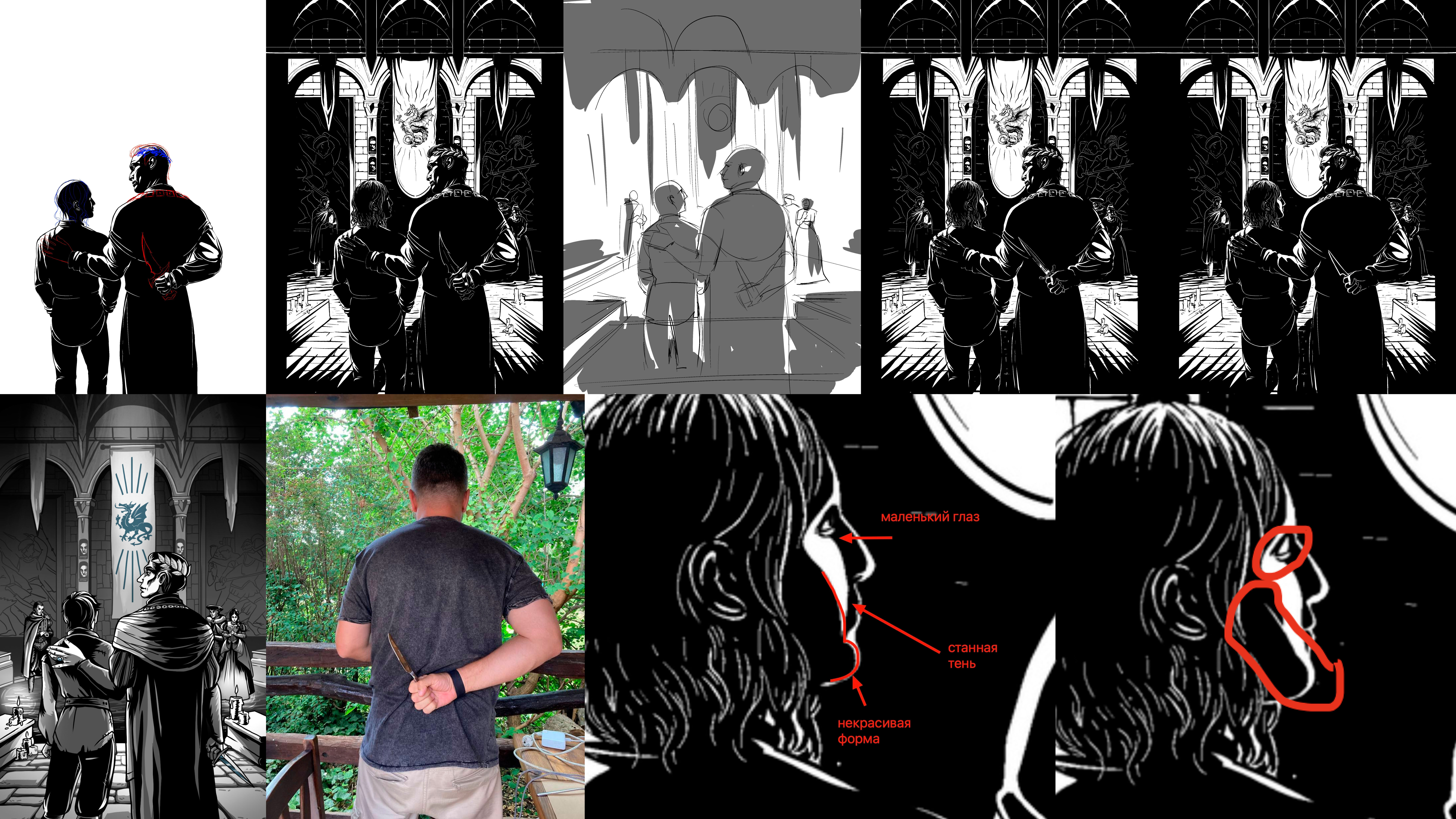
In the “Birth of Jerian” scene, we needed to draw attention to the “surprise” in the Tempest crypt and what awaited the protagonist there. Long ago, however, in early versions of the script, Cornelius did not warn him about anything.
Therefore, the main focus here is on the poses of the father and son, the way Uther holds the dagger (our art director even had to pose so that the artist could understand exactly what this gesture should look like), and the image on the tapestry.
The background details are rendered schematically. This was a separate and difficult task: making the background expressive enough, but not so specific and detailed that it drew attention away from the foreground.
“Triumph”
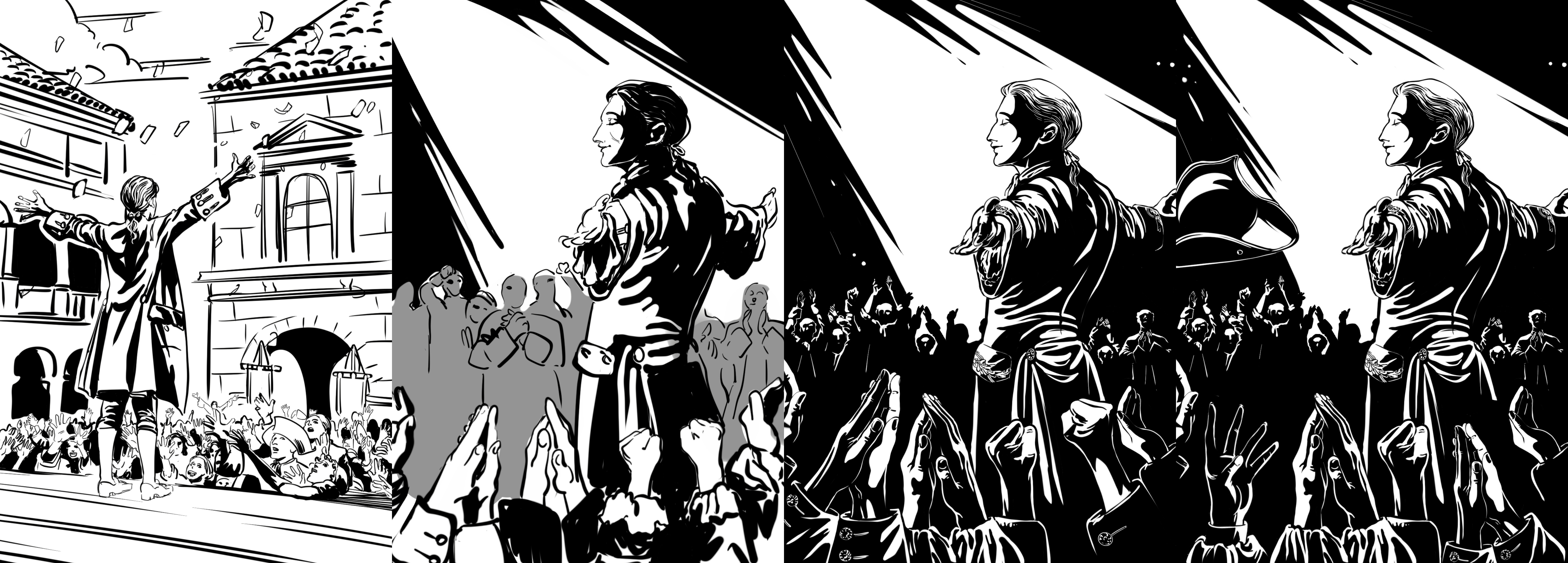
Here, by contrast, it was important to create an overall impression of the moment and convey the sense of triumph that Jerian experiences. There were far fewer requirements for non-focal objects, which resulted in some rough edges in the final version.
“The Big Game”
One of our most discussed illustrations was “The Big Game,” from the scene of the same name. In it, Gaius Tempest teaches the young prince the intricacies of court life, using chess as a metaphor: both players hold pieces in their hands, while the pawns stand scattered across the board, waiting to be placed on their squares so the game can begin.
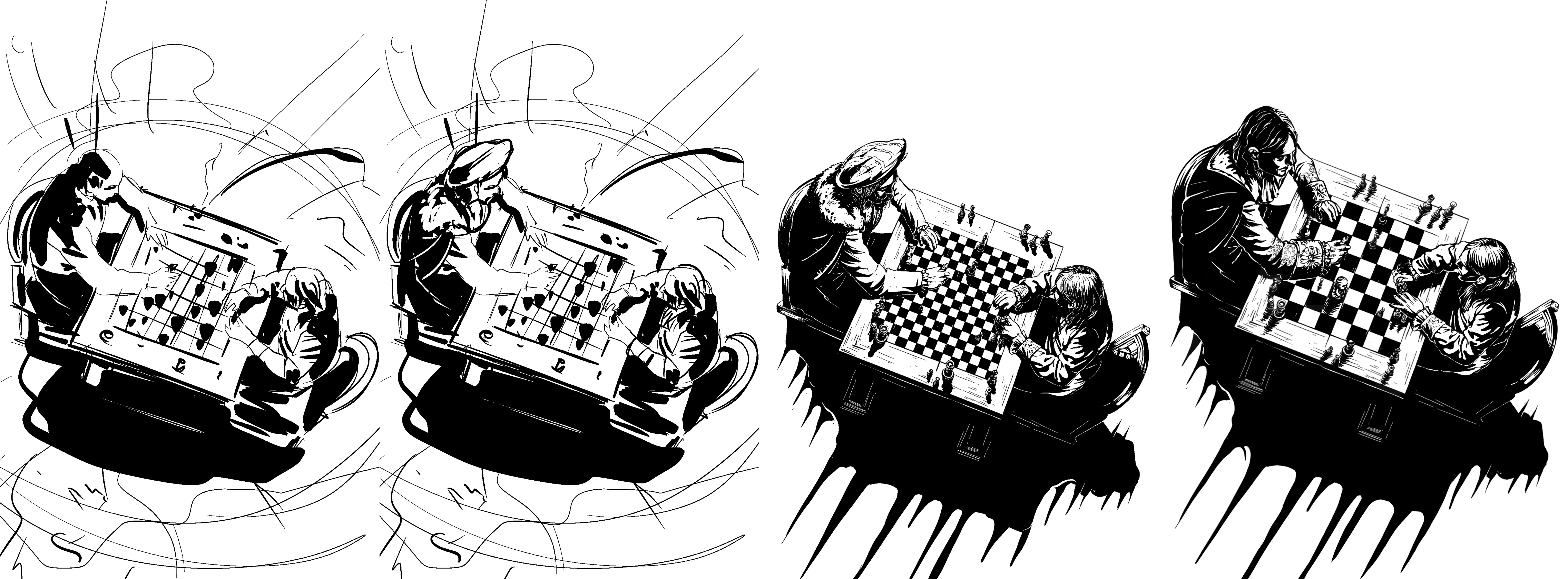
The number of squares on the board is one remnant of the early stages of our work. The first versions of the illustration did not follow the actual rules of the game, but unexpectedly proved to be an apt metaphor: the “board of the Empire” is more complex than a chessboard. For a while, we even considered keeping that version in the final game. Ultimately, however, we decided that it added too much ambiguity to the image and made the situation implausible, so we restored the board to its traditional dimensions.
Gaius himself also had to be given a change of clothes: many people noticed that he was sitting over the board in a beret and fur cloak. This created too strong a dissonance between the scene's text and the image.
“The Manor of Debauchery”
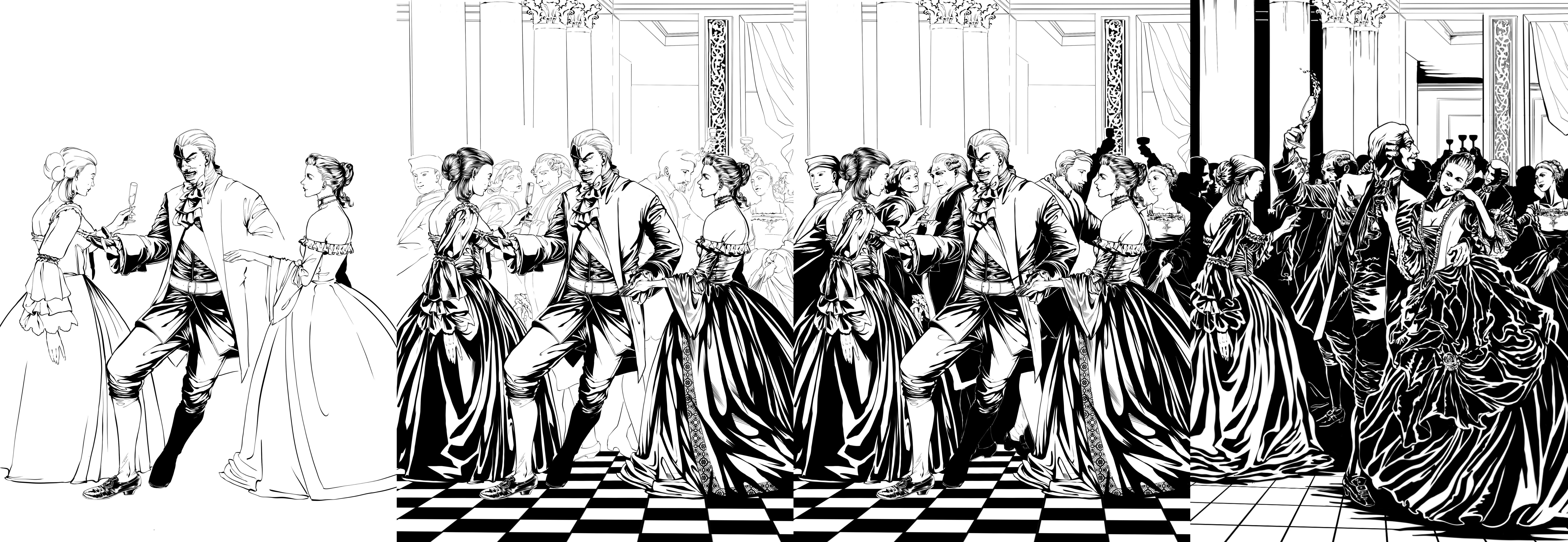
This is a large-scale illustration intended to convey the sheer scale of the revelry and the spirit of permissiveness and excess. Initially, we wanted a simpler solution: depicting a thoroughly drunk Arknian in the center. But then we had an internal discussion about exactly how the lady beside him should support him and what purposes the scene was meant to serve in the first place.
Ultimately, we completely redrew the two central characters. The man is still drunk and leaning slightly against the woman, but he no longer looks as though he is about to fall over.
“The Meal”
This is a very important scene for us, in which the conflict between Servilia and the Tempest family finally erupts. We wanted to focus less on specific characters than on the contrast between two forces: Servilia and her shadow. They are the true protagonists of this illustration.
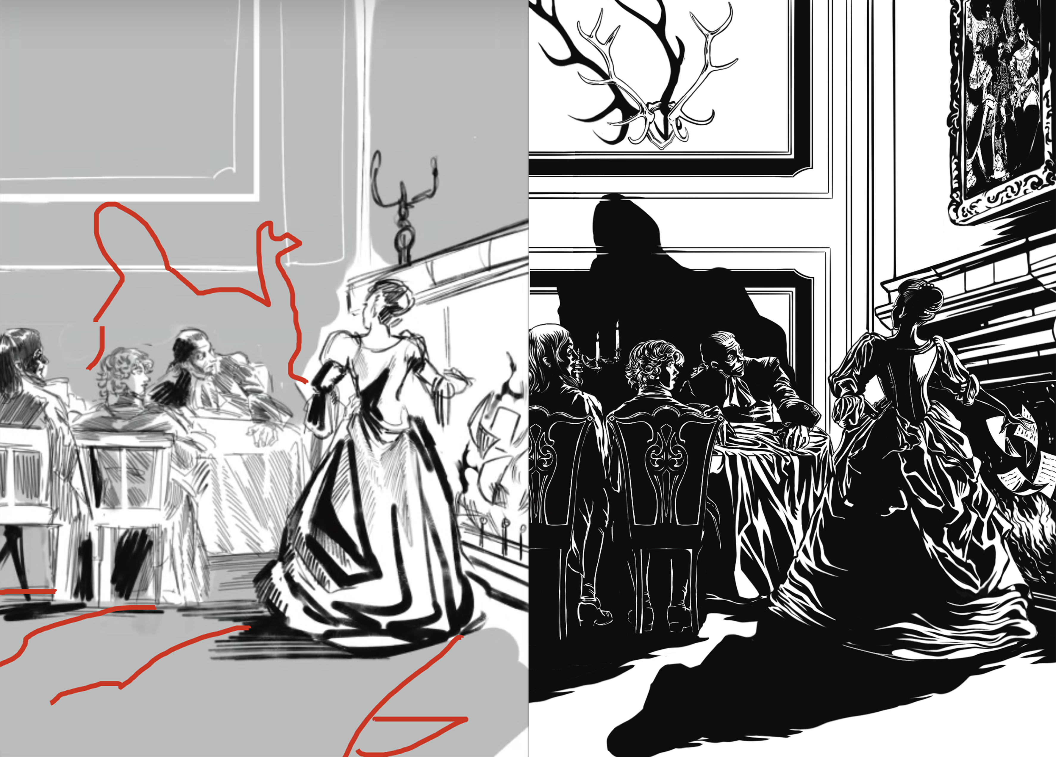
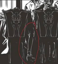
There is another amusing mishap associated with this image. The screenshot featuring the “leg of a nonexistent person” is often cited as evidence, but that image does not actually appear in any version of the game. Here is what happened: while producing the trailer, we needed to extend the frame horizontally, so we copied part of the table but forgot to remove the leg.
Unfortunately, such problems sometimes occur when you need to create not only the game itself but also a wealth of material around it.
Rooms and Gestures
Working on a game is never simple, even when it comes to minor details. Even an ordinary gesture—a hand holding a goblet—can prove challenging and lead to mistakes and inaccuracies.
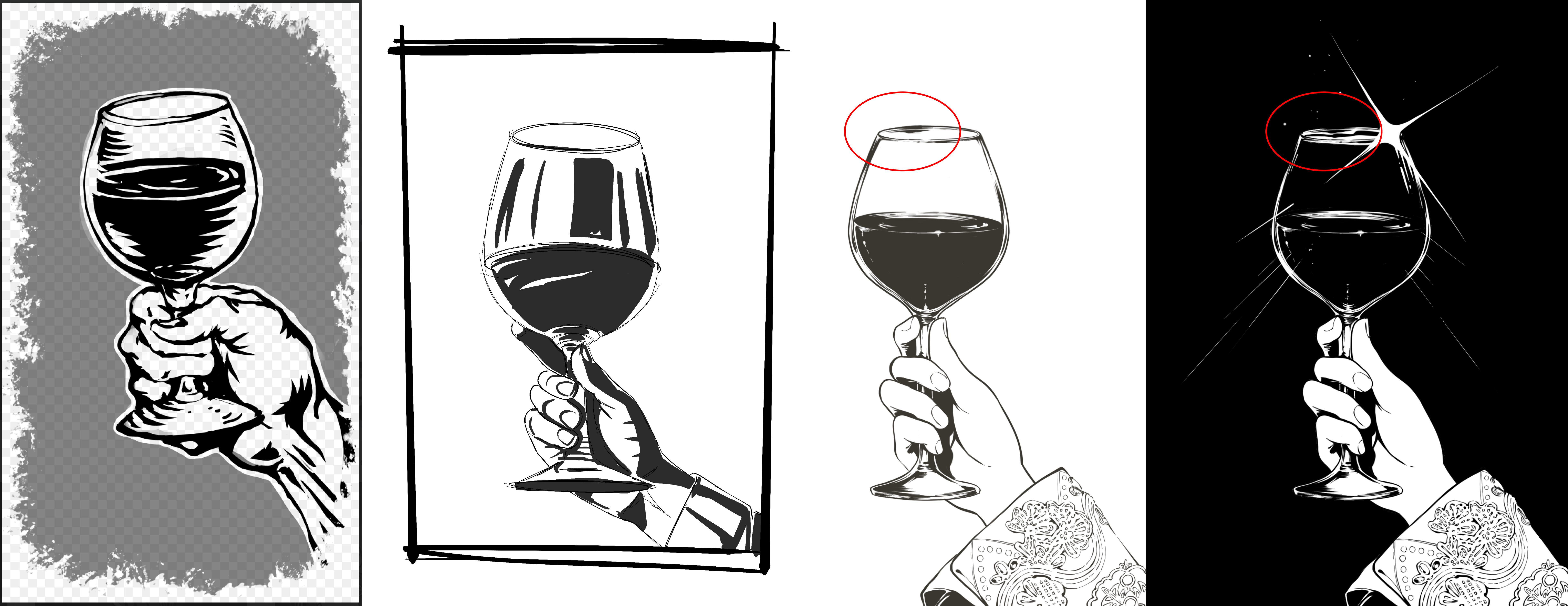
The mistake in the fourth image was that the outline had been filled with the main color, causing the goblet's clear edge to disappear. Nevertheless, we believe that creating a contrast between the goblet and the background and making it a recurring technique for all our “object illustrations” was a successful decision.
Jerian's Room
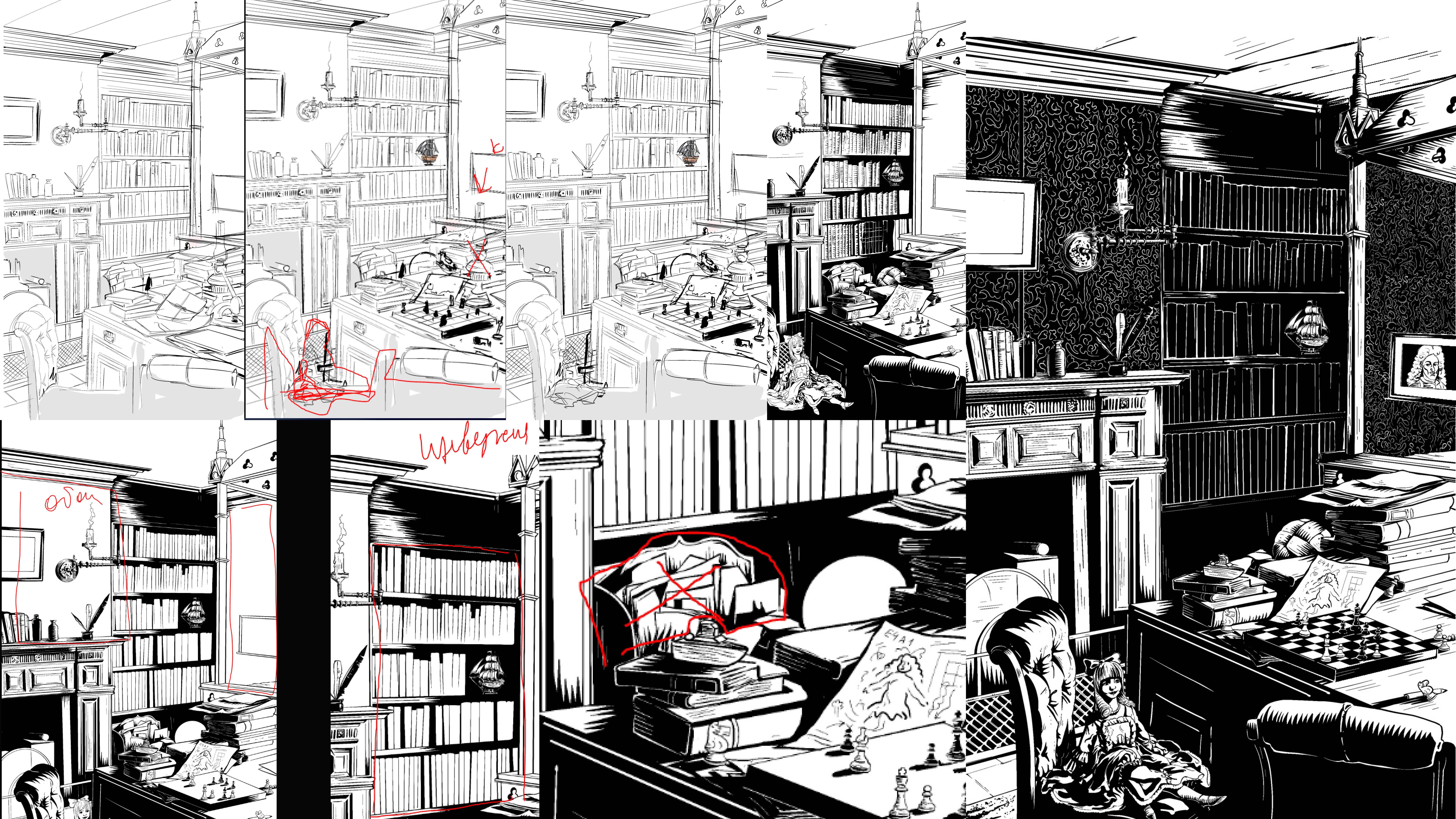
This was one of the first images created for the game. We were only learning how to construct interior spaces, and we spent a long time searching for the right solution, gradually coming to understand exactly what we wanted from the image and what it should be like. At some point, we realized that young Jerian should live in a room that was utterly unsuitable for children—a space completely alien to our usual idea of a place where a child grows up.
The year we worked on this illustration, our art director visited the Royal Castle in Warsaw for the first time and wanted to evoke a similar feeling: a space utterly alien to a small child. But to reach the final solution, we had to draw at least 15 different versions.
Workflow and Mistakes
We would like to say a few words about the mistakes that, as we ourselves recognize, are numerous in our game. But the main thing we want to convey is that we are delighted when you find them, point out specific flaws, and help us make the game better. We’ve tried to take a lot of your feedback on board and improve our visual style as much as possible in the latest updates—a style we’re genuinely very proud of.
We also wanted to share our experiences while working on the game so that you could put yourselves in our shoes and perhaps better understand the contradictions of the workflow and the decisions we had to make every day.
Throughout development, our focus was always on the player experience: the player's emotions and overall impression of a scene. The illustrations were only one of the tools—alongside the text, music, and overall game design—that contributed to this experience. We could not afford to invest unlimited resources in every image and had to move on as soon as the overall artistic objective had been achieved. Therefore, we assessed the quality of each illustration primarily by asking two questions: whether it creates the intended impression and whether it causes ludonarrative dissonance—a discrepancy between what the story says and what the illustration shows.
Every decision—whether to “keep refining the details” or “stop polishing the doorknob and send it to production”—was based on these key questions. If the main artistic objective had been achieved, we were prepared to accept individual flaws.
Mistakes in our illustrations arose primarily from the pace we had to maintain. Creating around 350 original and complex illustrations was no easy task for our relatively small studio. We consciously sacrificed the refinement of secondary details, especially in the backgrounds: as we have already noted, conveying the central artistic idea and creating as many original illustrations as possible for key scenes mattered more to us.
Second, we reworked completed illustrations many times to coordinate the work of the illustrators and writers or to fix errors discovered through playtesting and the demo version. This, in turn, led to new mistakes: when you focus on one detail, it is easy to lose sight of the whole.
Third, unlike a designer, a good illustrator is generally not a jack-of-all-trades: illustrators usually have a distinctive style that inevitably manifests in their work, no matter what we do. That is why, when examining the game closely, you may notice slight individual differences in composition, linework, and presentation. And that is only natural: the illustrations were drawn by real people with their own artistic handwriting, not by a silicon neural network.
It is also worth noting that over the years, our artists became increasingly familiar with the game's world and continued honing their craft. That is why some artwork created early in production and never revisited is occasionally weaker than later pieces.
To us, errors in illustrations are problems just like inaccuracies in translation, incorrect punctuation, or game design errors. When we receive reports about them, we will work on them and make corrections. We are extremely grateful for your help in discovering any flaws that interfere with playing and becoming immersed in the game.
Finally, we would like to thank everyone who has delved deeply into the game, strives to understand its essence, and explores the fate of Prince Jerian, its meanings, its system of imagery and symbols, its sounds—everything from which it is made.
Thank you! We see your words, your interest, and your support, and we deeply appreciate every voice.💚
