Hey everyone!
I wanted to reveal a bit of history and reasoning behind the new UI update. This was the 7th iteration of the UI. The first 6 are briefly documented in the art book (The Journey DLC), which will eventually be appended with the 7th iteration too.
Let’s shine a light on some of the details for you, which should hopefully address some of the criticism the new UI has received.
Collaboration
The UI rework was my collaboration with Mikhail Gofman aka Ingevar. He had an absurdly difficult task of reorganizing the chaotic, organically grown legacy UI into something coherent and easy to use. If we had more time and a bigger budget, the UI could have looked fancier, have animations, etc, but this isn’t a AAA game, and I have set up a long list of constraints and requirements to work with. Mikhail definitely nailed this job, I am very happy with the result!
Hard Constraints
At the beginning of the collaboration with Mikhail, I set several constraints:
Icons couldn’t change. Stardeus UI uses ~500 icons, all of them made by yours truly with questionable art skill. The time and budget wouldn’t allow us to redo any icons, so we had to keep the original ones.
Programmatic layout. This means the UI has to be panels and lists, vertical or horizontal, no fancy custom curved elements or whatever that makes it impossible to inject new bits of UI via code. This is for the sake of modability. As an anti-example of what I didn’t want to get, I included this picture:

I have nothing Against the Game it was taken from, I just wouldn’t want Stardeus to have such a UI. It’s also way too “artsy” and distracting for my taste.
Steam Deck compatibility. The UI has to work with 1280x800 screen size, and have high readability. Maintaining perfect Steam Deck support is my personal crusade. I also play Stardeus mainly on Steam Deck myself.
Responsive design. The UI has to work with any screen aspect ratio and resolution. Widescreens, ultrawides, 1280x800, 4K - anything a PC can have, Stardeus UI must stretch into it.
Font. I wanted to keep using the font I was already using for the old UI. Eventually I selected a new (very similar) one for better CJK (Chinese / Japanese / Korean) support, but it was and still is a highly readable font, which some gamers shun because it’s something you see all over the web. But at least you don’t have to squint or decipher some cryptic pixel art stylized nonsense. (The only game that got pixel art fonts rights is Stardew Valley. Change my mind.)
Time. This was the biggest constraint. Mikhail was on the project for only 2 full months. There was no way he would have enough time to redesign all 250 screens and panels (yes, there are that many), so he had to redesign the important bits only, and I had to use the foundation, patterns and guidelines he established to finish the less important parts. If you encounter something weird, it’s very likely my blunder. But I will be revisiting and repolishing everything for years to come.
Soft Constraints
Here’s an excerpt from the collaboration doc about my expectations for the new UI. These weren’t hard constraints, but rather my “wishlist”, which Mikhail definitely delivered:
Functional Minimalism: hide all unnecessary information of minor importance, especially in the main view, when nothing is selected. It would be best to have a few corners of the screen completely empty. If possible, the bottom right corner could be left empty for streamers to put themselves in, and people read that corner last.
Visual clarity: easy to tell what’s clickable and what’s not, what’s a button, what’s a slider, etc. Some of this can be achieved by changing the colors and images used in current UI widgets.
As little on screen as possible in the standard mode.
Most critical information available at a glance at all times.
Least amount of clicks possible to reach even the deepest UI panels.
Stylistic minimalism: prefer information readability and clarity of what UI element does over visual appeal. Think RimWorld - the UI is arguably ugly and spartan, but highly functional.
Dynamic and modular: Adding a new button in the main screen should not require redesigning the UI. Buttons can be added through mods, and may be added or removed during development when mechanics change. This restricts the UI from being custom tailored / styled where elements are laid out in some fancy shapes with artsy backgrounds.
Consistency: when an object gets selected, it’s information and related actions should appear in the same place, regardless of the object type (colonist, device)
Contextual modality: when an object gets selected, the most important actions should be listed out in the same place as clear, large buttons.
At-a-glance information: when an object gets selected, the main info panel should show the most important “at a glance” view, so the player should rarely have to open up additional dialogs.
Low friction: actions that are normally done frequently should be as frictionless as possible. Like building a copy of something should be no more than 2 clicks and very obvious - first click to select the object, second click on a clearly visible action button on screen to begin the relocation process.
Reduction of UI element type and panel type variety.
Main controls and action buttons in one corner (bottom left?).
Rethinking what types of UI panels are actually necessary to play the game. The current approach is very programmer-oriented and systems based. If I have an in-game system, it will likely have a UI panel for itself. If some entity component can be configured, it will add a button that brings up the configuration subpanel for that component. This works very well for me as a programmer, but this approach also leads to the current UI overload. Some things have to get cut out, grouped together by logic, or split apart.
No tiny fonts. Many of Stardeus players aren’t youngsters, and tiny fonts make it difficult to play many management games. Stardeus has UI scaling and separate font scaling to combat this, but it would be nice to have default UI looks that aren’t using tiny fonts anywhere.
Biggest Problems with the Old UI
Before kicking off the redesign collaboration, I’ve crunched all Stardeus Steam reviews and got a long list of things that bugged the majority of players when it came to UI. Here’s a very condensed summary:
Players find the UI overwhelmingly cluttered, confusing, and visually unappealing. They report excessive menus, poor categorization, unintuitive controls, inconsistent layouts, tiny icons, unreadable overlays, and too many steps to perform simple actions. The interface feels like “spreadsheets in space,” not a game. Many say it ruins an otherwise promising concept.
Overall Impression:
“Messy,” “chaotic,” “spreadsheet-like,” and “painful to look at.”
UI actively prevents enjoyment and learning.
Feels untested and not designed with user experience in mind.
Repeated calls for a complete UI redesign by a professional designer.
So there you have it. For every veteran player who suffered through learning the old UI, there were likely dozens of new players who couldn’t get over it and abandoned the game. It’s time to get those players back on board!
Change Is Difficult
Yes, I’ve read your feedback, some of you don’t see the new UI as an improvement. I knew this would be the case, it always is when something big changes. People dislike change in general, but sometimes you just have to break some crooked bones to regrow them straight. The old UI was a crooked bone.
Here’s what I wrote in the original UI redesign collaboration document back in 2025:
Risk of backlash
Every time something big changes in the game, there is often a backlash from some veteran players who were used to and liked the old way. I’m absolutely certain that full rework of the UI will cause a backlash and a bunch of negative reviews. I don’t know how to avoid it, except for making the new UI very easy to understand and learn.
As I always say in situations like this - I can’t please everyone. However, I hope you will grow to at least tolerate the new UI eventually. It is really, REALLY objectively better than the old one.
—
That’s the end of my part, now let’s give the mic to Mikhail - let’s hear what he had to suffer through working with my picky constraints. I’m sorry for what you had to go through, and thank you for your hard work, it was a pleasure working with you!
- spajus
Mikhail’s Word
Hello, I’m Ingevar.
Last year spajus asked me to help with the UI rework. My background is 16 years working as a game and UX designer on many different games, but the most relevant experience for a game like Stardeus comes from my days at Paradox, working on games like Stellaris, Hearts of Iron 4, Crusader Kings 3, and Europa Universalis 4.
Reworking UI for a complex game with tons of interconnected mechanics is a very big challenge. Of course I had to start by playing the game a ton -- no good design can come from someone who doesn’t understand the game well. But even now, after 100+ hours, I still do not consider myself a “pro” in Stardeus -- the game keeps surprising me in every playthrough.
After initial impressions settled down, we started with the main screen. One of the obvious problems was that it was overloaded with information, and for new players that meant that important things were hidden among less important things or even things you can’t use in the beginning, like expeditions or terraforming.
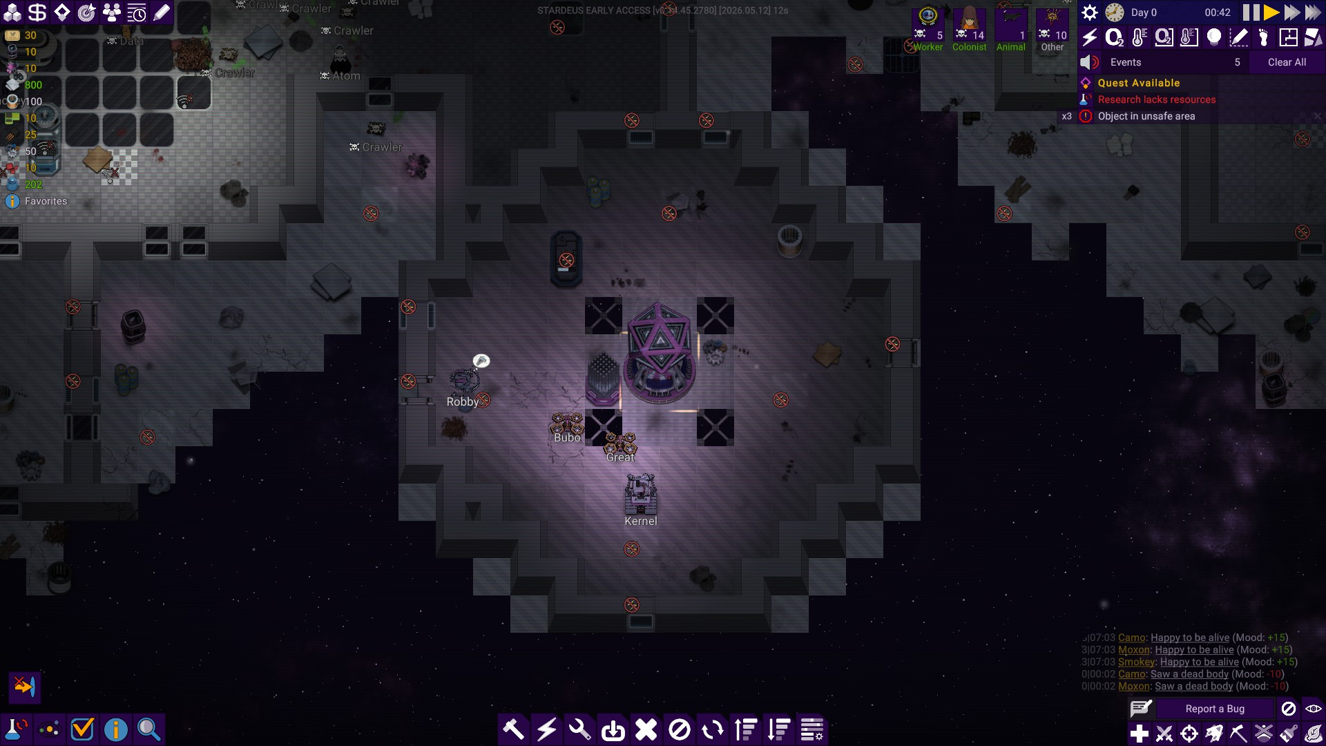
My approach to tasks like this is to remove everything and see what is absolutely needed. The needs change as the game goes on, but there are obviously things that you need from the start, like tools to build and connect things, an overview of your beings, basic resources, etc.
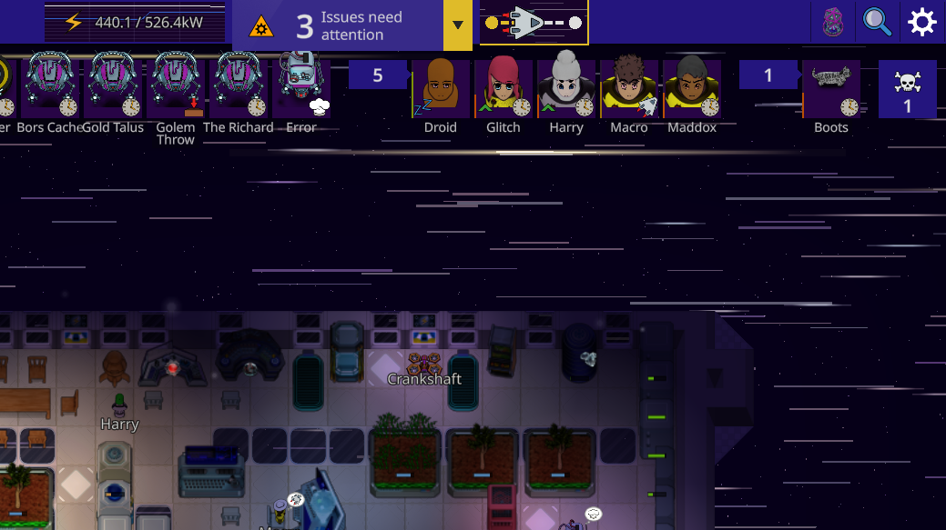
After a few iterations, we landed at the current screen, which has it all:
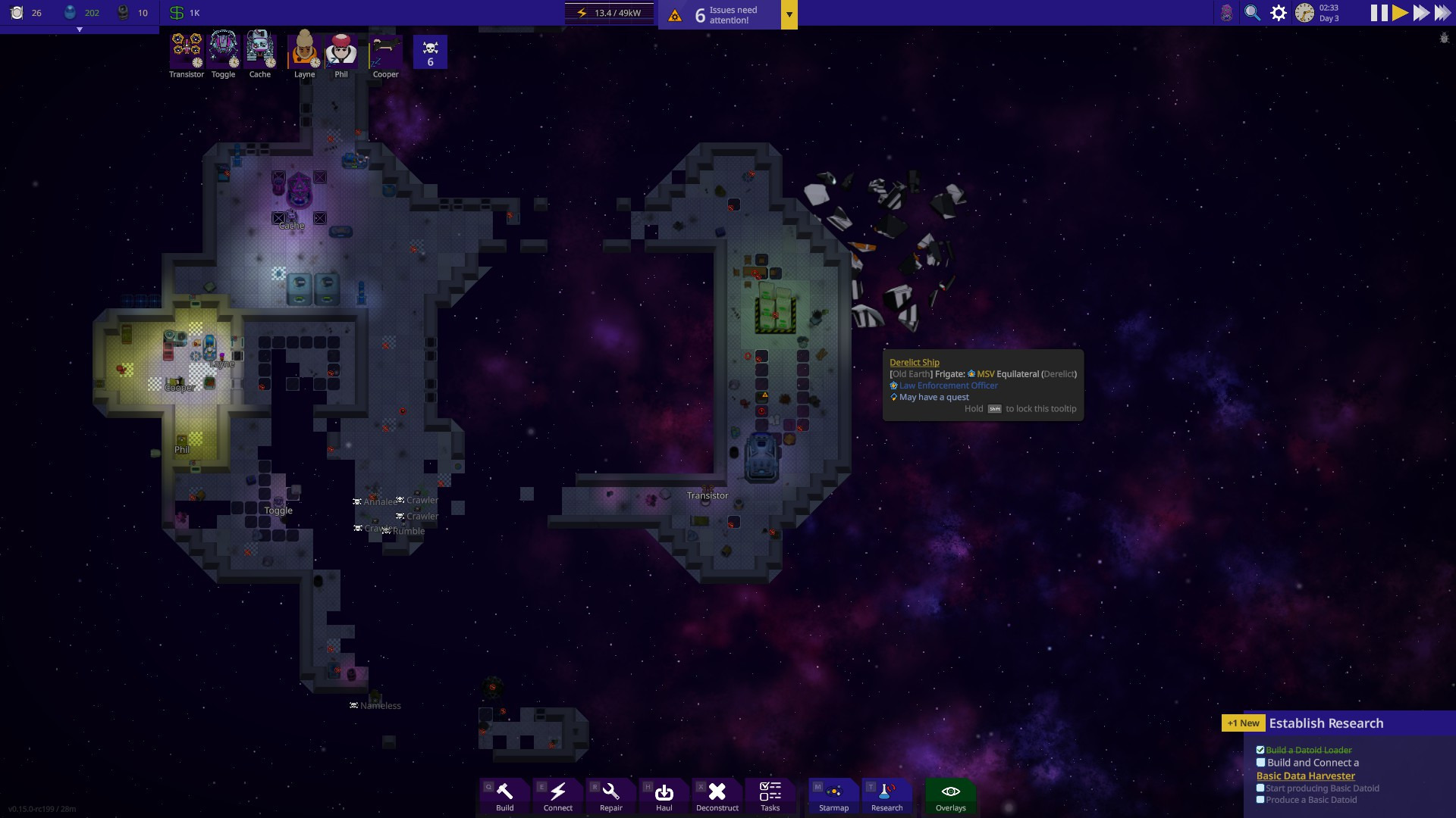
It clearly tells new players that important things you will manage throughout the game are your beings, things you build, energy, food, and water. It also highlights quests as the main way of learning how to play the game.
Some information is important, but it doesn’t have to be on the screen all the time. This is how the Hyperjump widget was born. It appears only when you start a jump and lets you change the direction, abort the jump, or simply view the progress.
Another major pain point was the device window. A new player looking at this would wonder: what is this about, what is important, and what is secondary here.
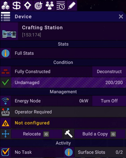
One helpful thing when designing a window like this is to treat it as a conversation. As if this window, when it appears on the screen, says: -- Hello, I’m a Device; my name is Crafting station.
So far so good.
-- I am located at 153:174, I have full stats, I’m fully constructed and undamaged, my energy node…
At this point, one might wonder: do I need to know all this? What are you? What can you do?
The new design rearranged the information so that the most important thing is in your face. This is a Crafting Table, and its purpose is to produce. Hence, the default tab has nothing but production.
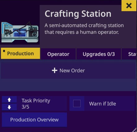
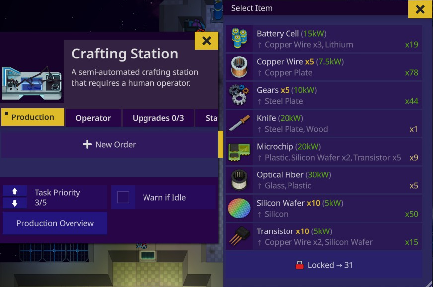
Now the conversation looks much more sane: -- Hello, I’m a Crafting Table, I can produce things, like Batteries, Copper Wires, etc. Other information is still there, just in other tabs. It lets players digest information in portions, which is good for your mental health!
Making the new UI was a constant back and forth between spajus and me regarding new mechanics, importance of information, and priority for every aspect of the game. Spajus has a very strong and clear vision for the game, so it was easy to update things while keeping the core feeling and pace of the game the same.
As a designer, I’m of course interested in making things pretty, sometimes at a price of functionality. But spajus has managed to keep me at bay and directed the game into the best shape possible. Some of the iterations were either too much visually; just look at these titles xD
(NOT IN THE GAME, EARLY MOCKUP)
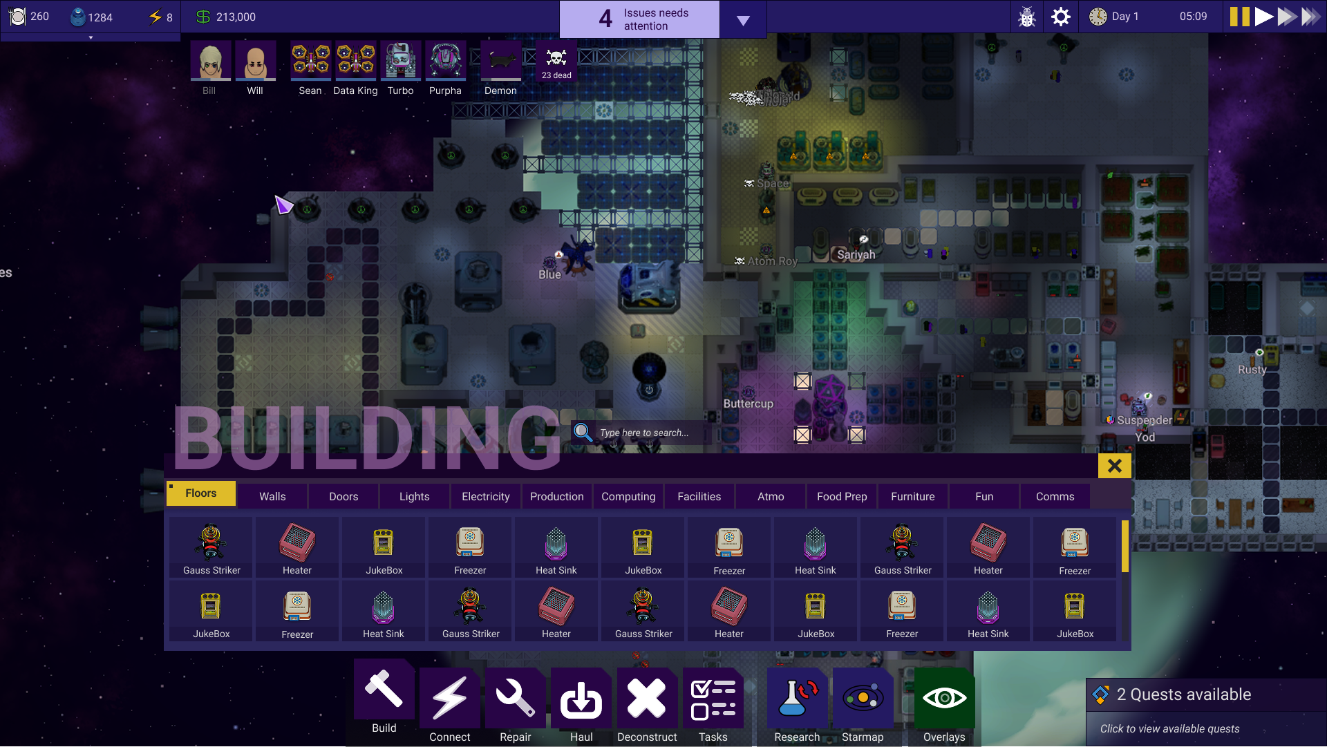
Yeah, good thing we discarded it…
We also experimented a lot with ship combat, with me trying to add waaaay too many minigames to the battle.
(NOT IN THE GAME, EARLY MOCKUP)
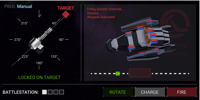
After all, we settled on a much more sane screen:
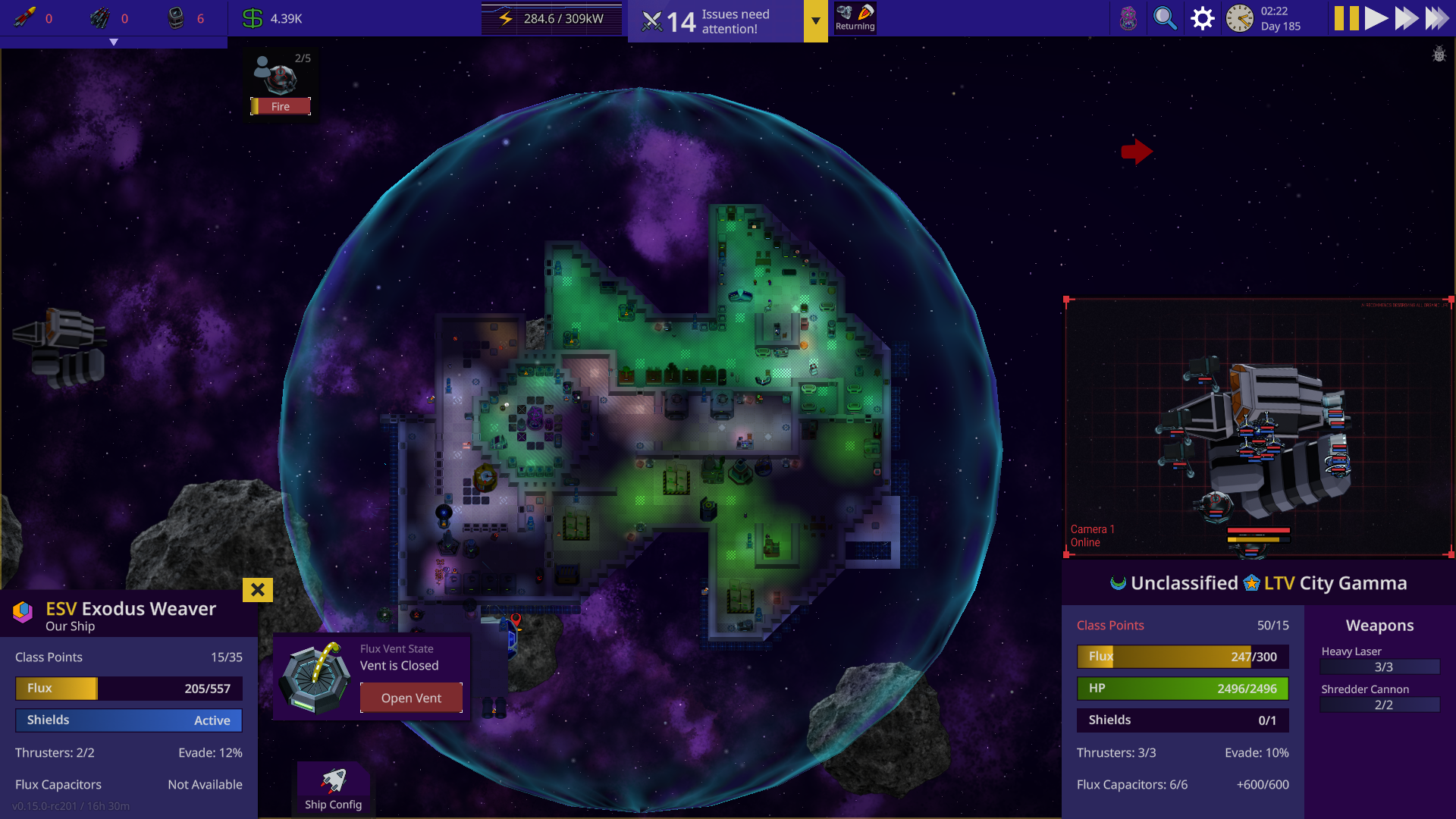
Of course, none of this rework would be possible without the help of our enthusiastic testers. Huge thanks to everyone who posted their feedback in the #ui-rework channel on Discord; without your help, we would not be able to make it as good and polished as it is now.
I think the new UI is simultaneously better for newcomers and great for experienced players. My job here is done, but I will keep playing the game and hanging out in Discord. Looking forward to hearing from you; any feedback is very much welcome.
And remember, pirates are not only a good source of protein, but also a fun distraction for your depressed crew!
- Ingevar
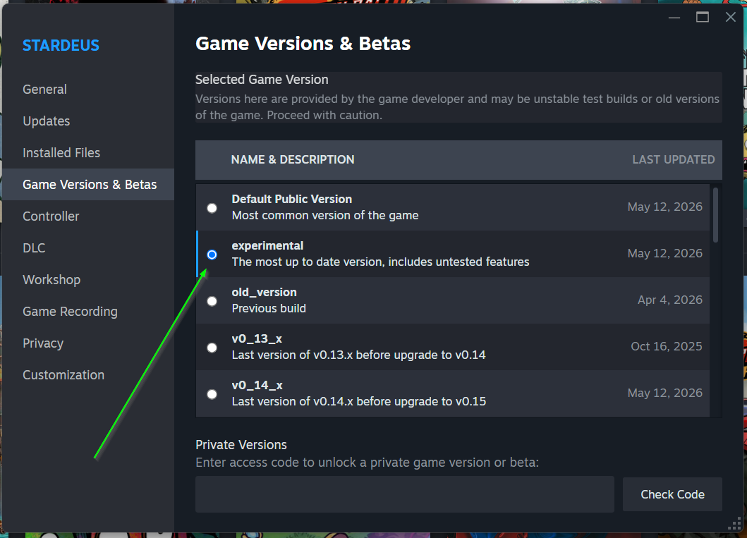
Try the preview build
Right-click Stardeus in your Steam library.
Choose "Properties."
Select the "Game Versions & Betas" tab.
Choose the "experimental" version.