So, we've heard a lot of feedback when it comes to the new UI!
Mostly it's been about people being afraid it will be less complicated than the old UI, taking away some of Stardeus charm… We hear your words loud and clear, but rest assured we're here to showcase before and after pictures so everyone can get a better idea of what is changing and how it's going to evolve.
Make sure to read also to get a better understanding of what we want to highlight in each screenshot. Also remember it’s still a work in progress, and things might subject to change.
Main Menu
Before:
 After:
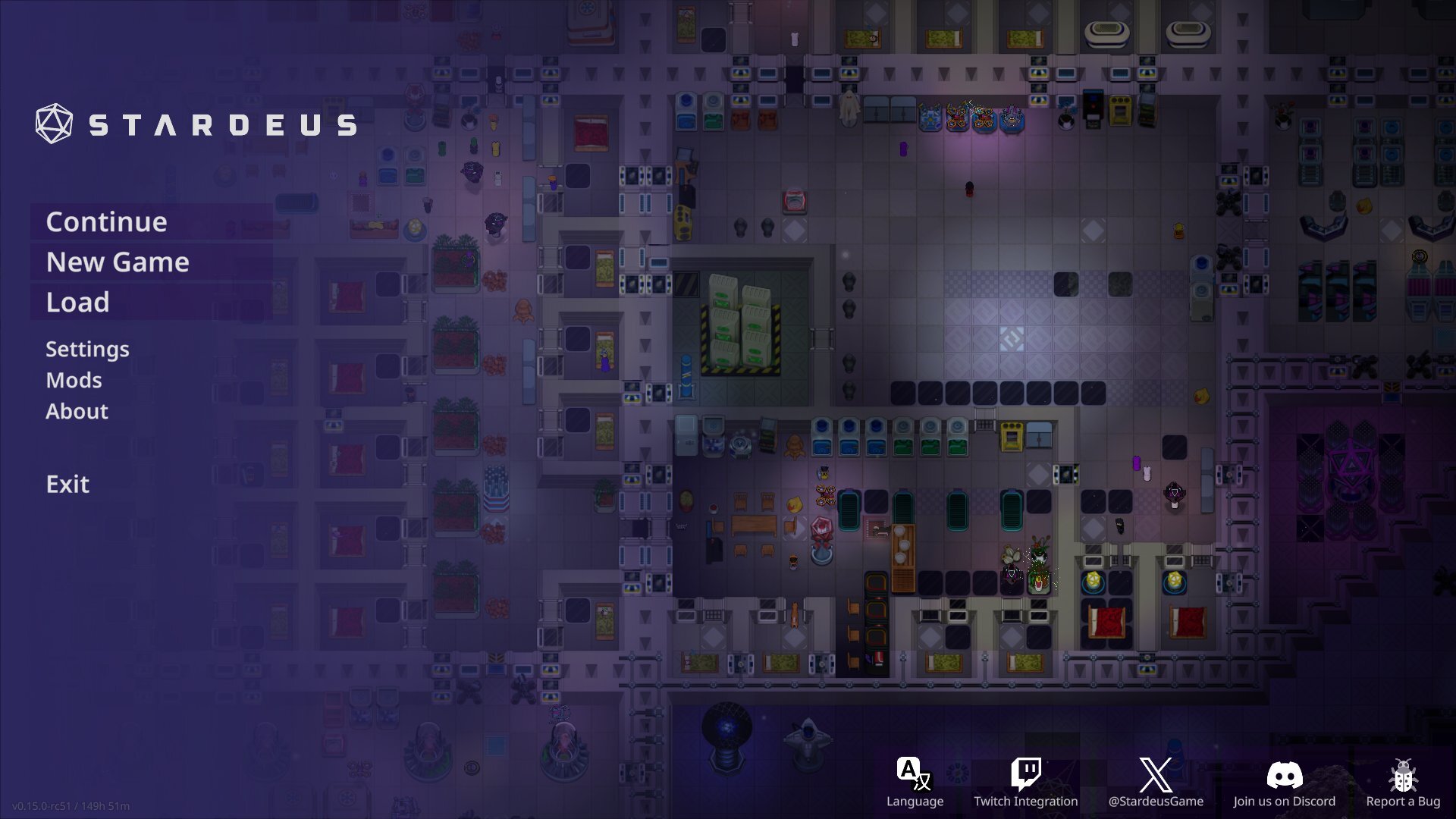
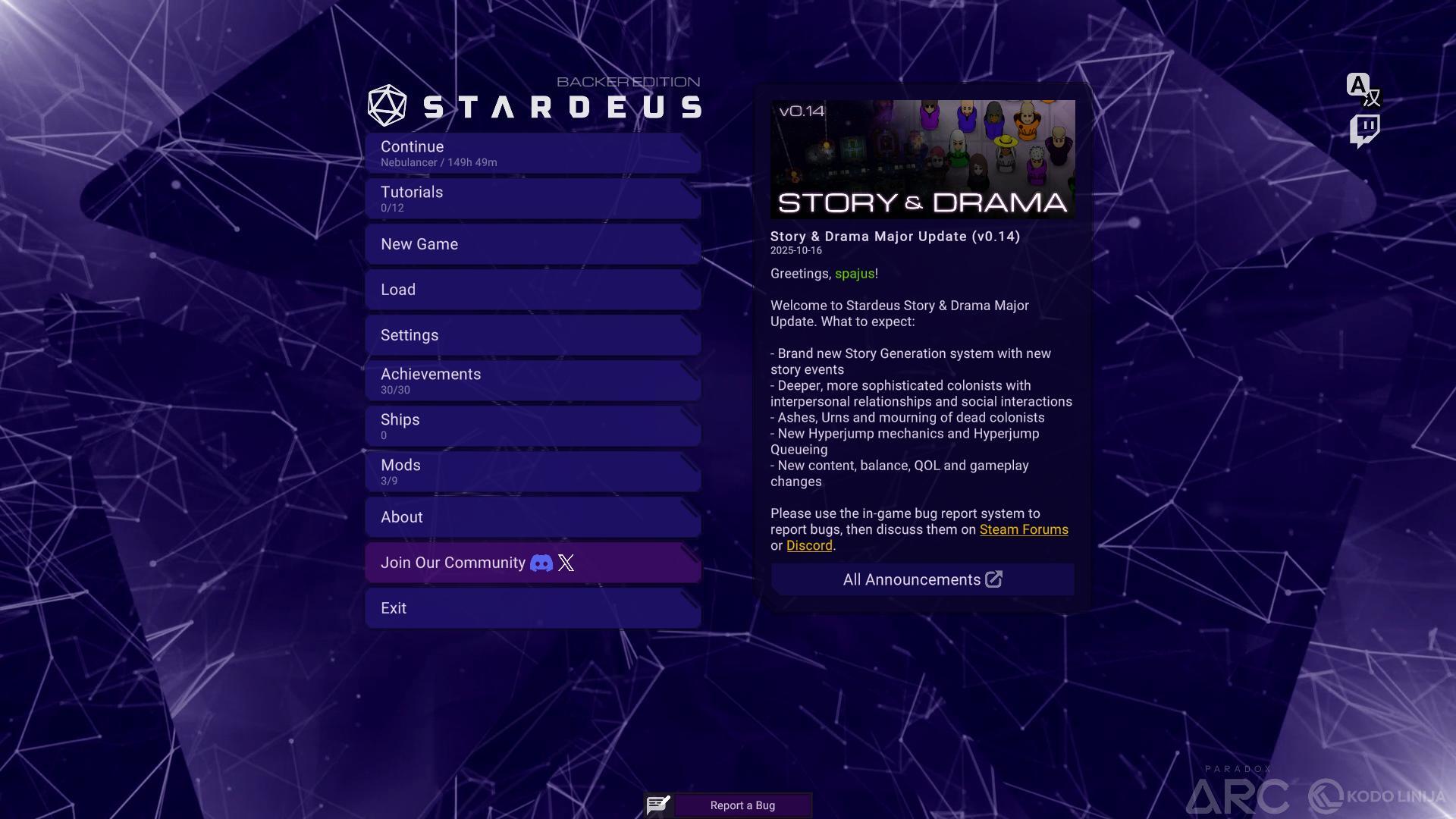
A major change when it comes to the main menu is that it will use your last saved game as a backdrop. And also; clicking Continue will let you play right away – seamlessly.
Settings Menu
Before:
 After:
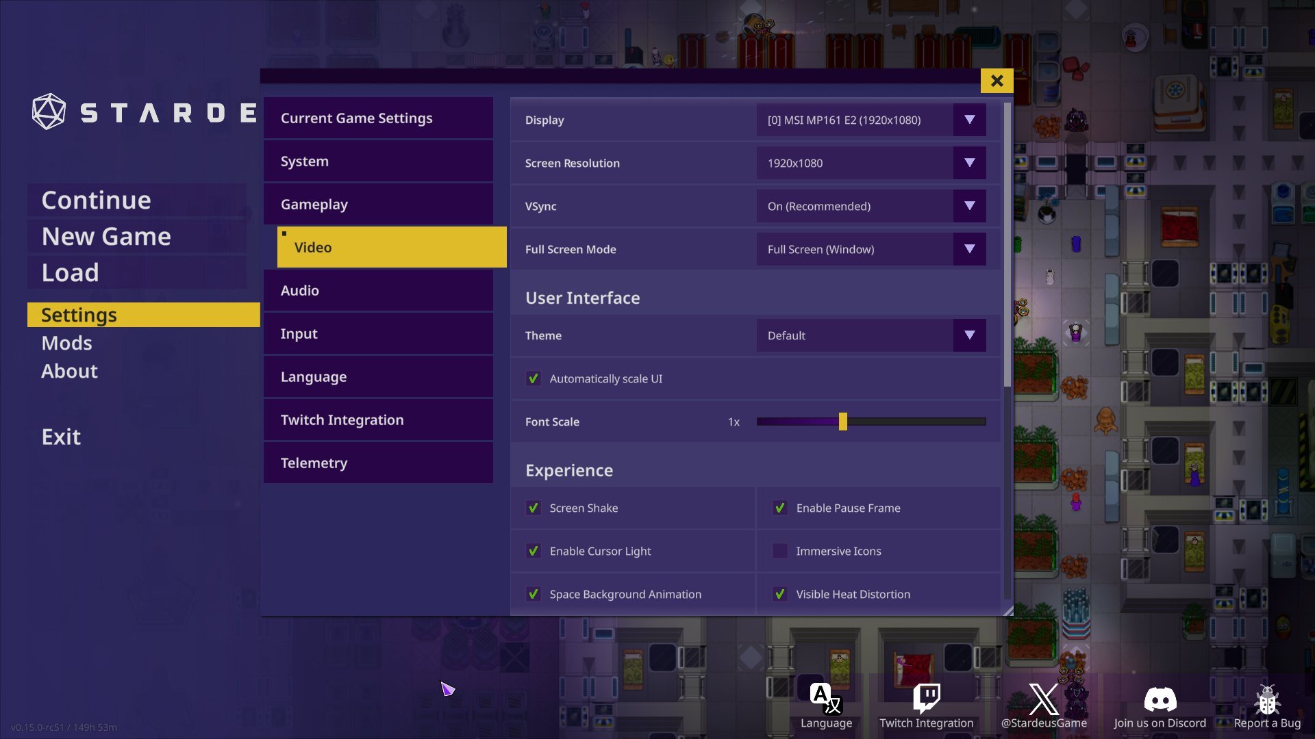
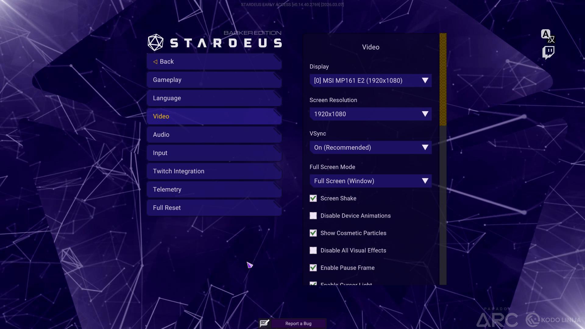
Main menu settings have been merged with the in-game settings menu, so they will have the same settings available. It has also been reorganised and had huge improvements to readability. Some settings that used to be exclusive to the main menu are now also available in-game and can be applied instantly instead of having to reload your save file.
UI Themes
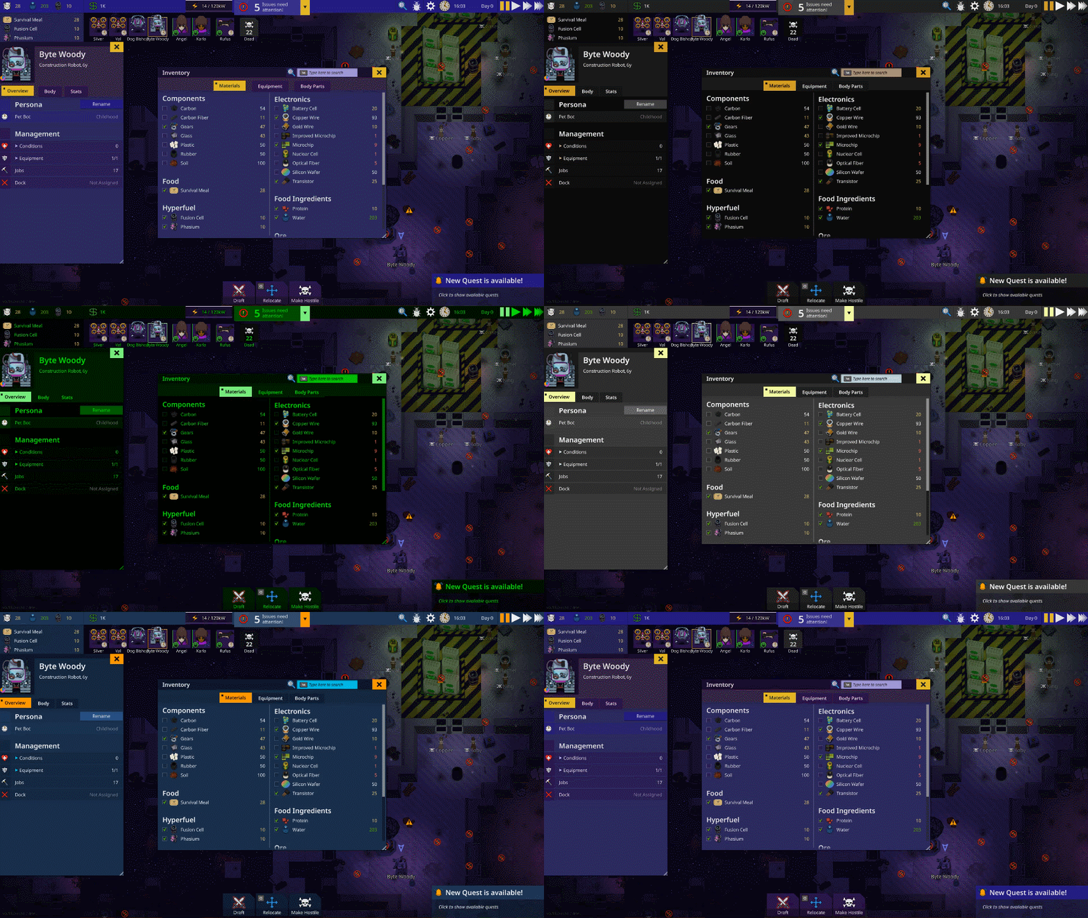
The new UI allows you to change colours to your heart’s content! A highly requested feature, and you can create your own themes too.
UI Scaling
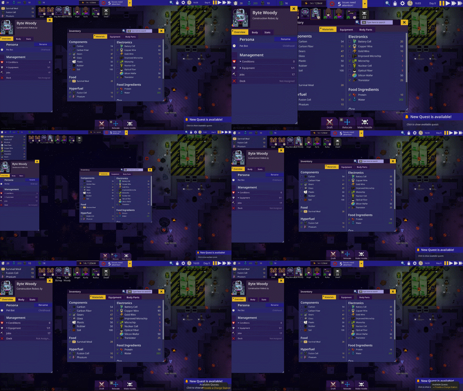
Just like the old UI it will support dynamic scaling and font sizing. Focus has also been put on lower resolutions like the Steam Deck (1280x800) & some UI elements will have different versions and arrangements depending on the screen size for easier gameplay.
Game View
Before:
 After:
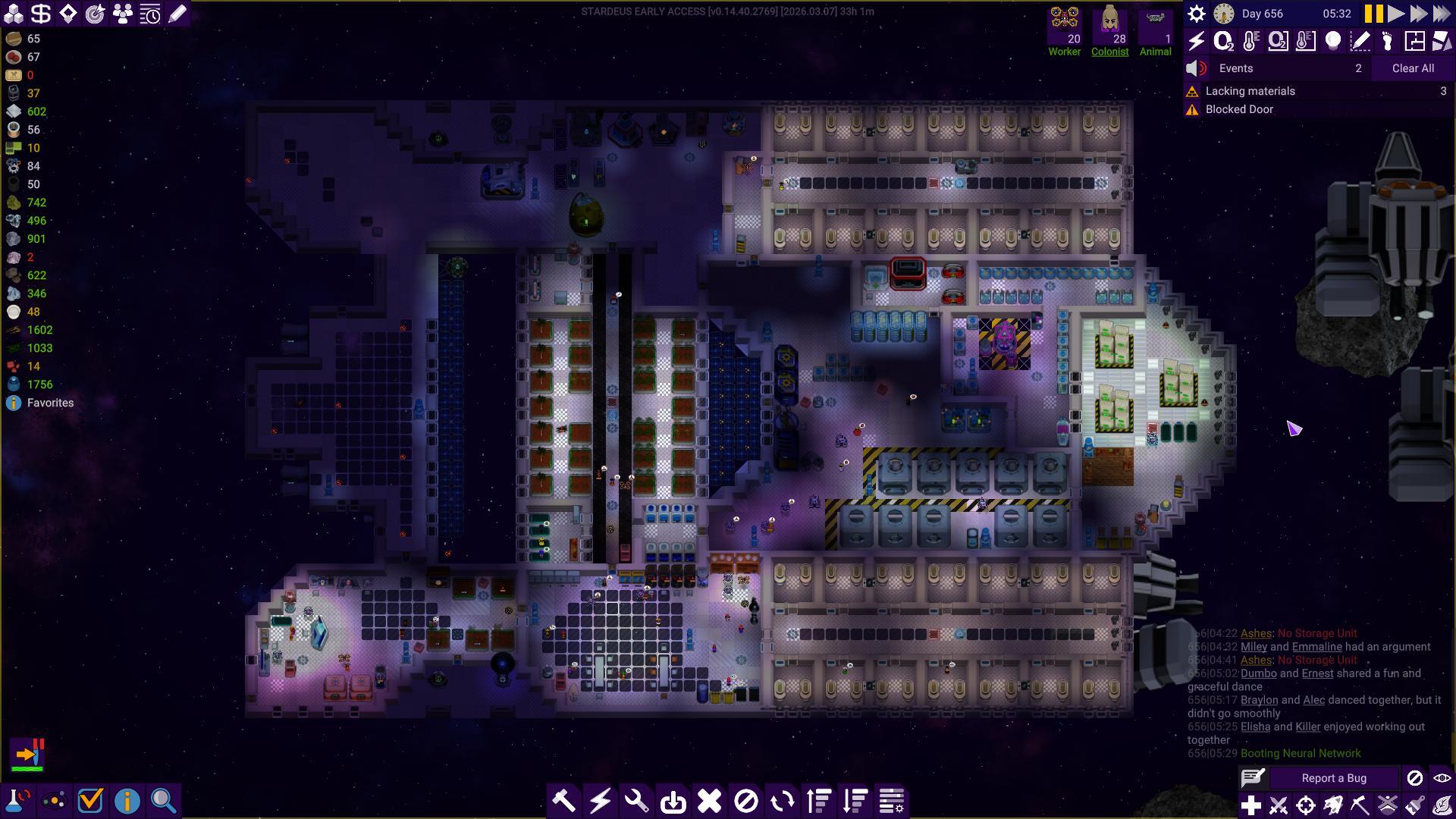
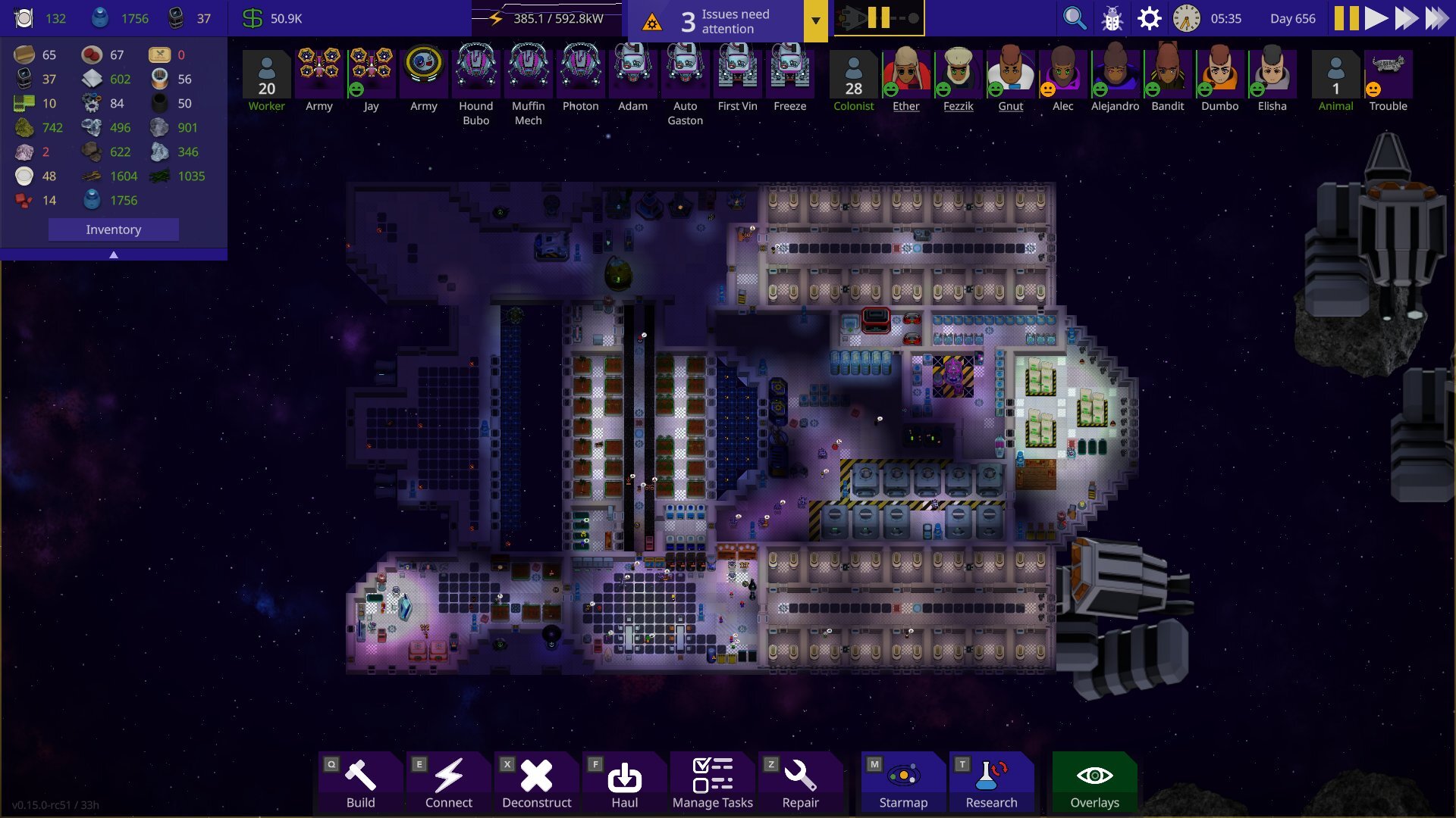 The old game view had nearly 50 visible buttons in the main screen at all times and could at times be very cluttered and frustrating for new players. Veterans who’s gotten used to it for years liked it for the information it granted so that is something we wanted to be careful about not changing all too much.
The new game view focuses on clarity and minimalism with high signal to noise ratio.
TLDR: Less buttons you never use and more information at a glance.
Selected Being
Before:
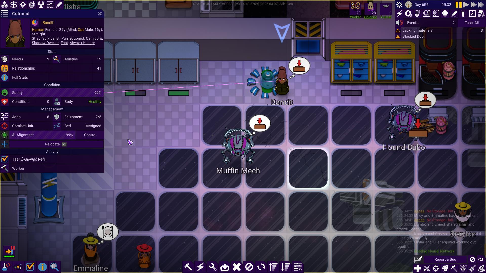 After:
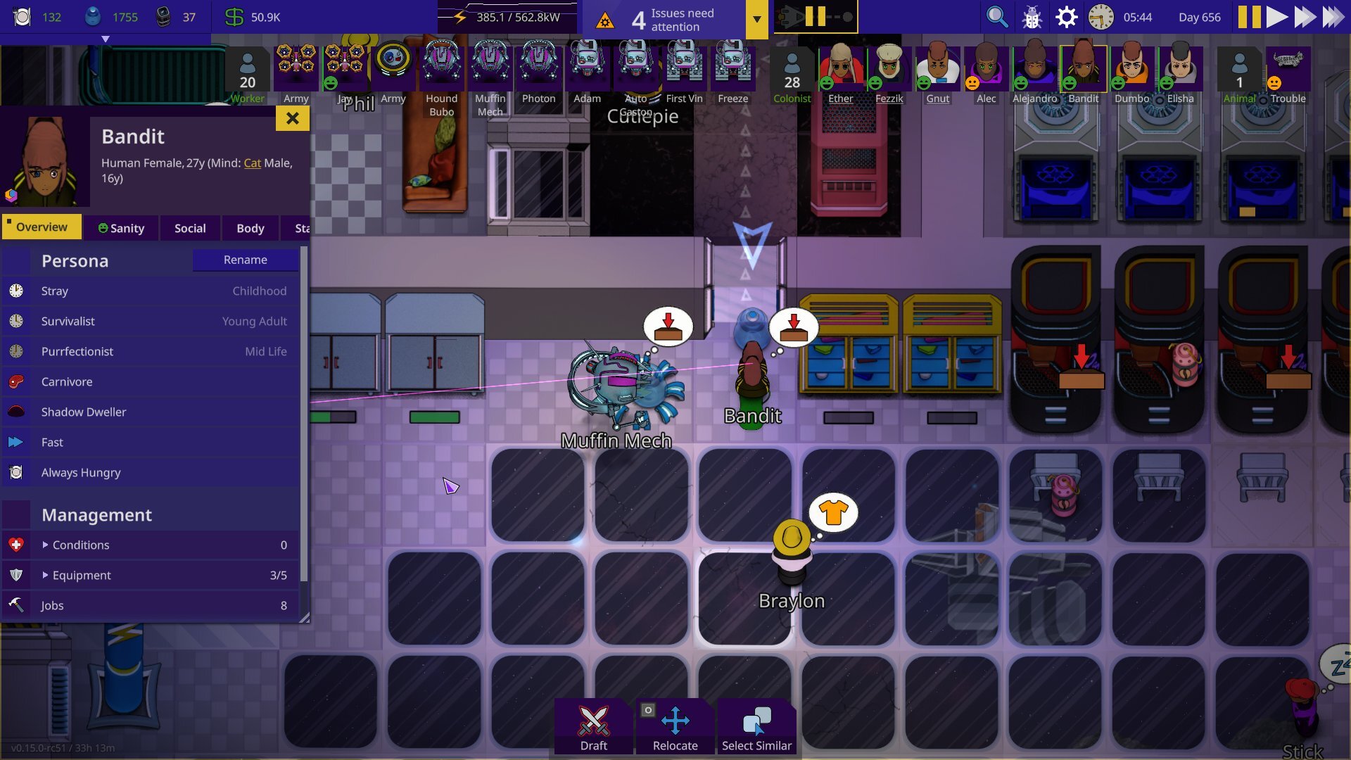 In the old UI when you selected a being it was condensed into a single panel. Although this was information dense, it could also be very hard to understand what was clickable and not. In the new UI all types of information has been reorganised into tabs & all actions you can perform has been moved into the bottom of the screen.
Notification Hub
Before:
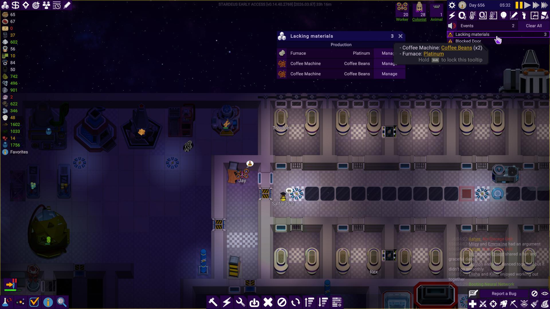 After:
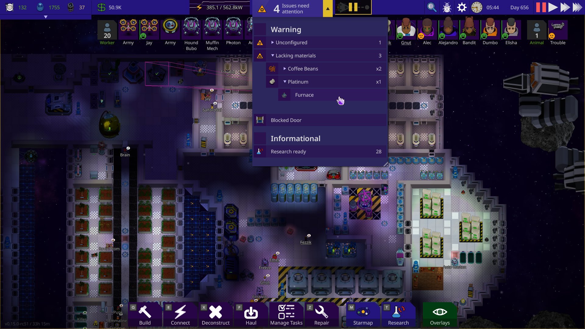 We noticed how the notification hub became something players usually just ignored after a while of playing, adding to the UI fatigue. We’ve addressed this in the new notification hub with the number of notifications and an icon of the most important notification showing at a glance. Expanding hub gives you a list sorted by importance. The expandable list makes it easier to drill into the details of each notification. For instance, previously we needed a separate UI for listing devices that lacked materials, but now it’s built straight into the notification hub.
Inventory
Before:
 After:
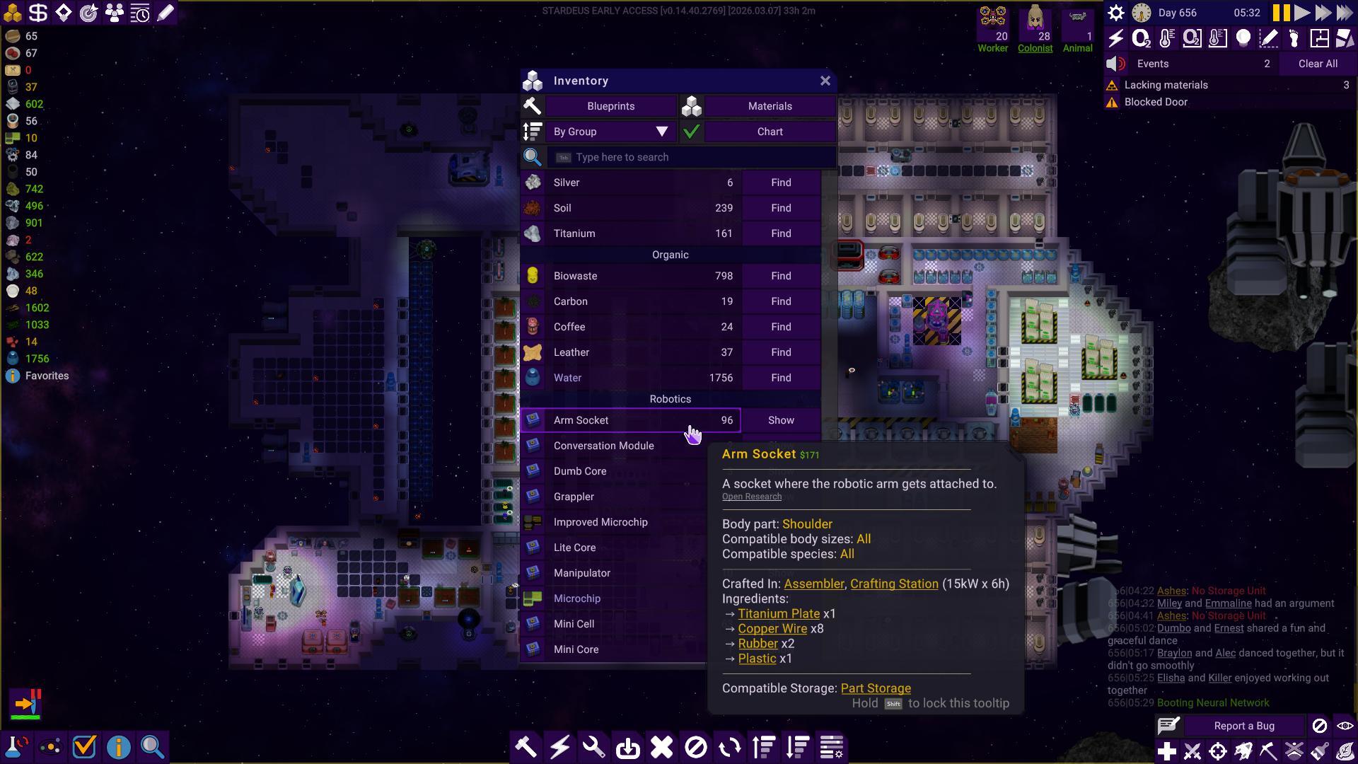
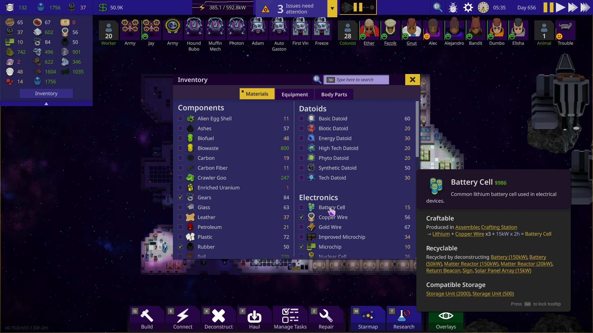 The new inventory is a lot easier to navigate! The categories are easier to read & configuring the favourites list (renamed to ”Quick Drawer”) is much more intuitive than before. Just tick whatever you want to add to it. Another improvement the drawer has is the ability to configure to not let materials show up in the drawer unless you own X amount. Anyone who’s concerned about functionality fear not- hovering over any items’ numbers will display the chart. Clicking the item name will also show a quick choice menu with more options.
Device Configuration
Before:
 After:
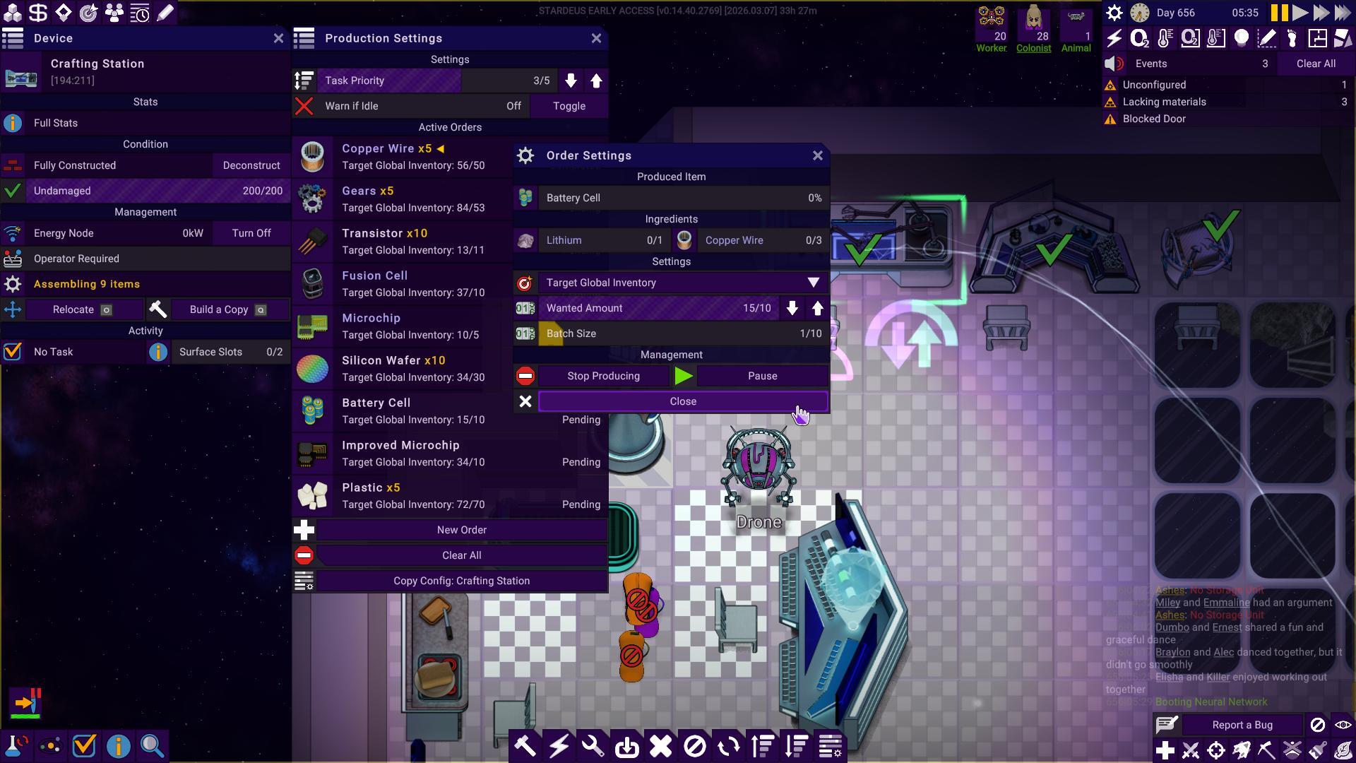
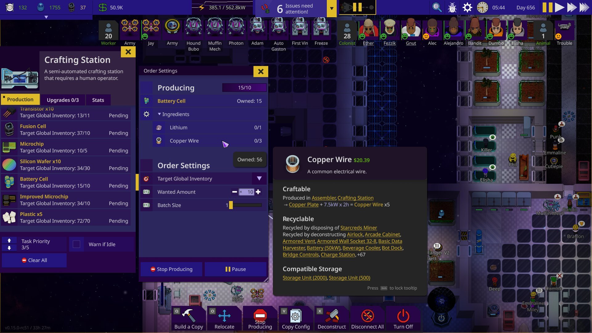 We’ve reduced the amount of windows to configure crafting devices from three to two. It’s also much easier to read as well as we’ve moved the upgrades and stats to their own tabs.
Trading
Before:
 After:
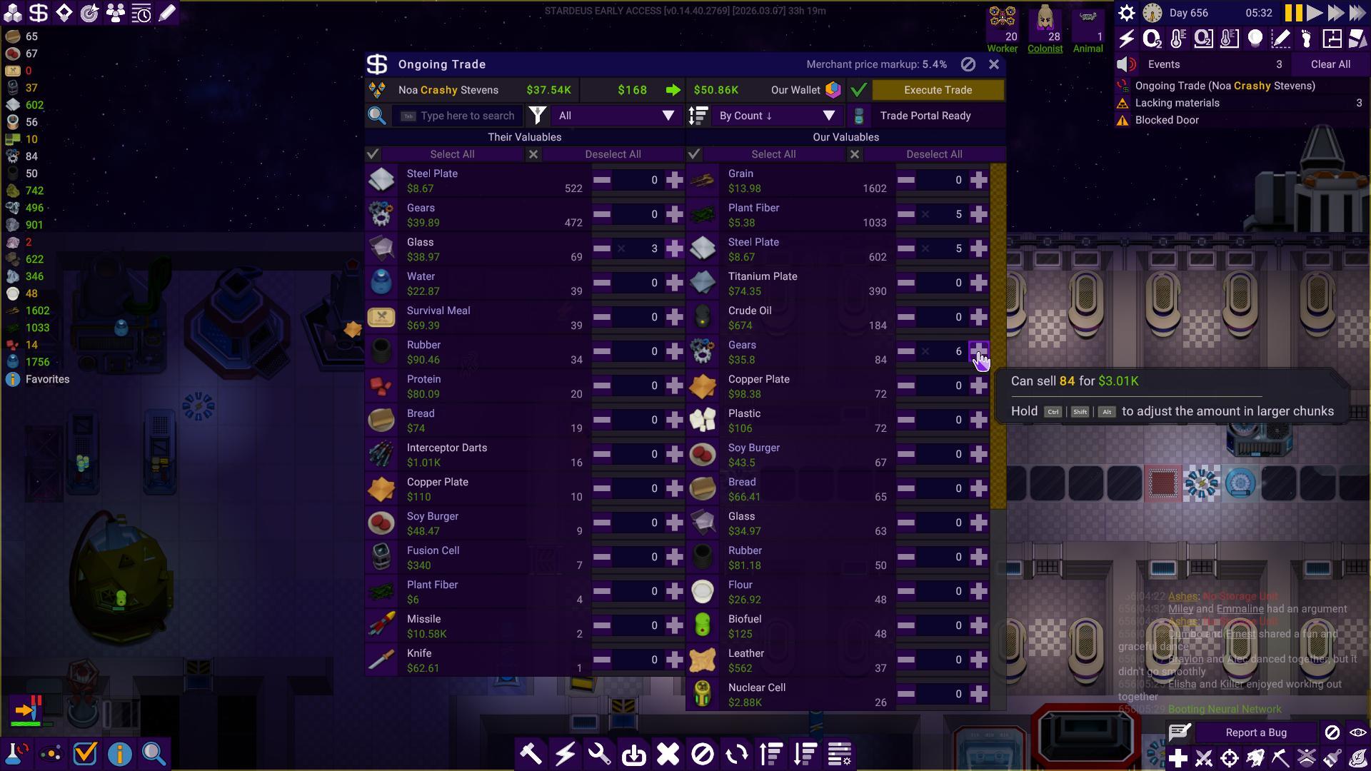
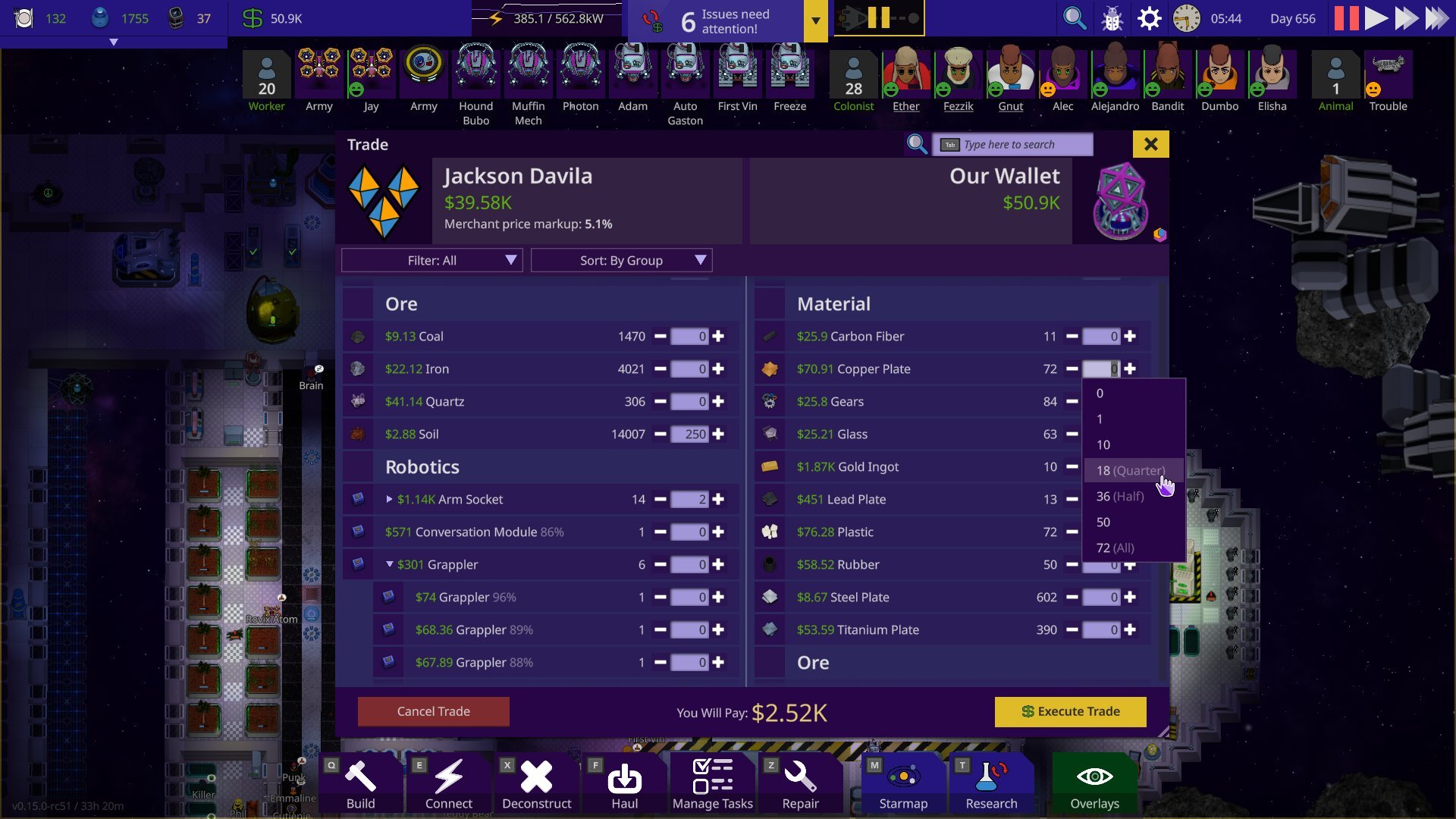 The new trading UI solves a lot of issues the old one had. There’s a simple drop down list if you click the amount, and it will also prioritise the lowest quality items when selling, and highest quality items when buying in bulk.
Part/Organ Storages
Before:
 After:
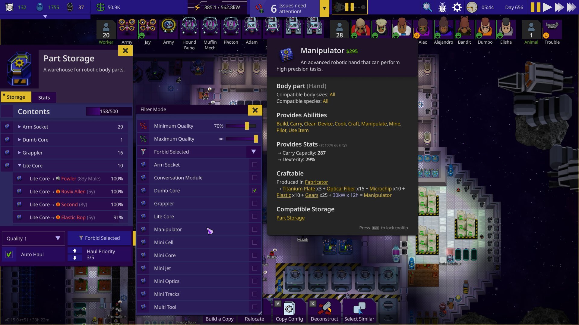
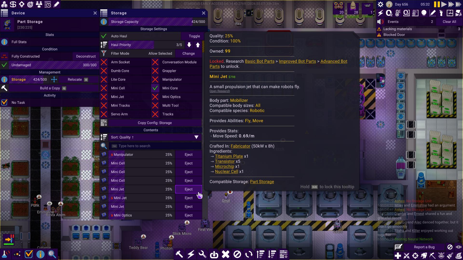
Part and organ storages have been reorganised to be expanded by body part and new settings for qualities have been implemented. You can set a quality range to only accept a certain parts/organs of a certain range and even eject and tell your colonists to dispose of parts/organs of a certain range with just two clicks.
Quests
Before:
 After:
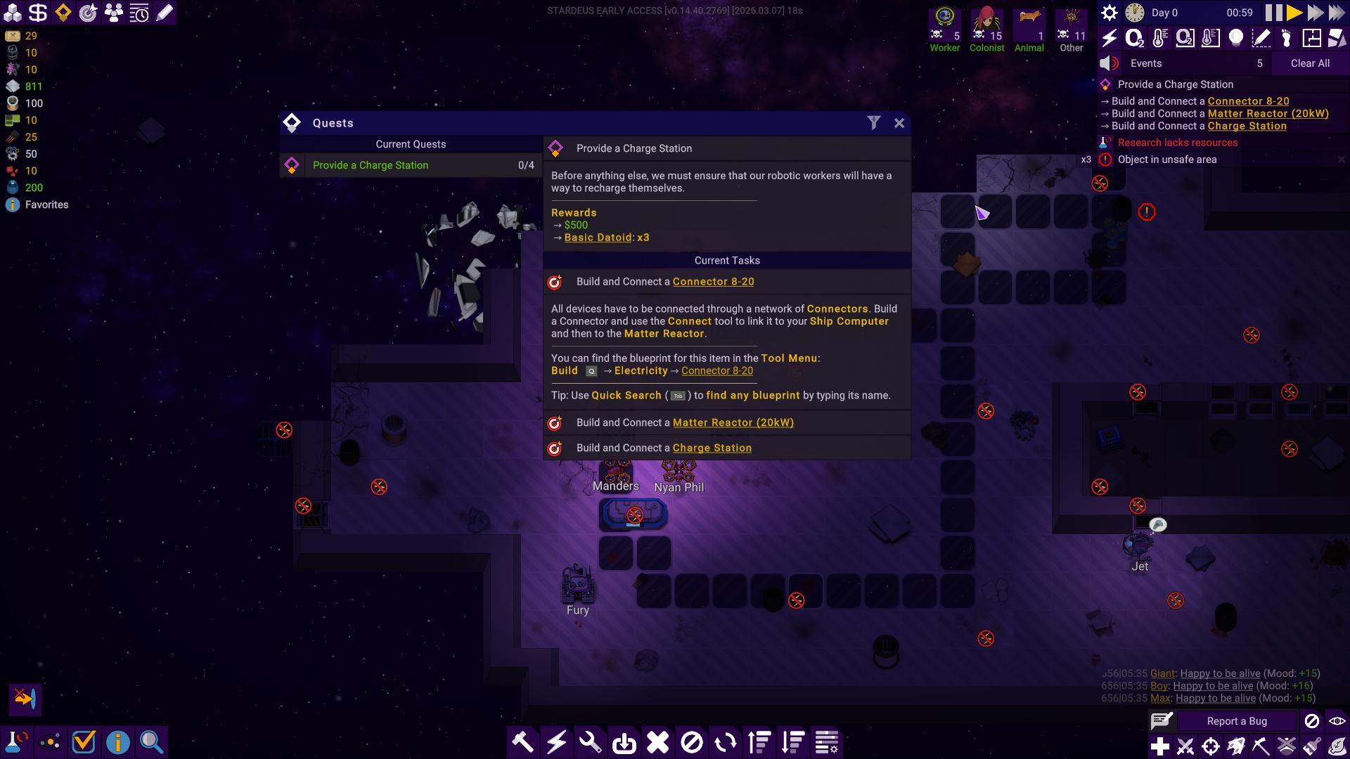
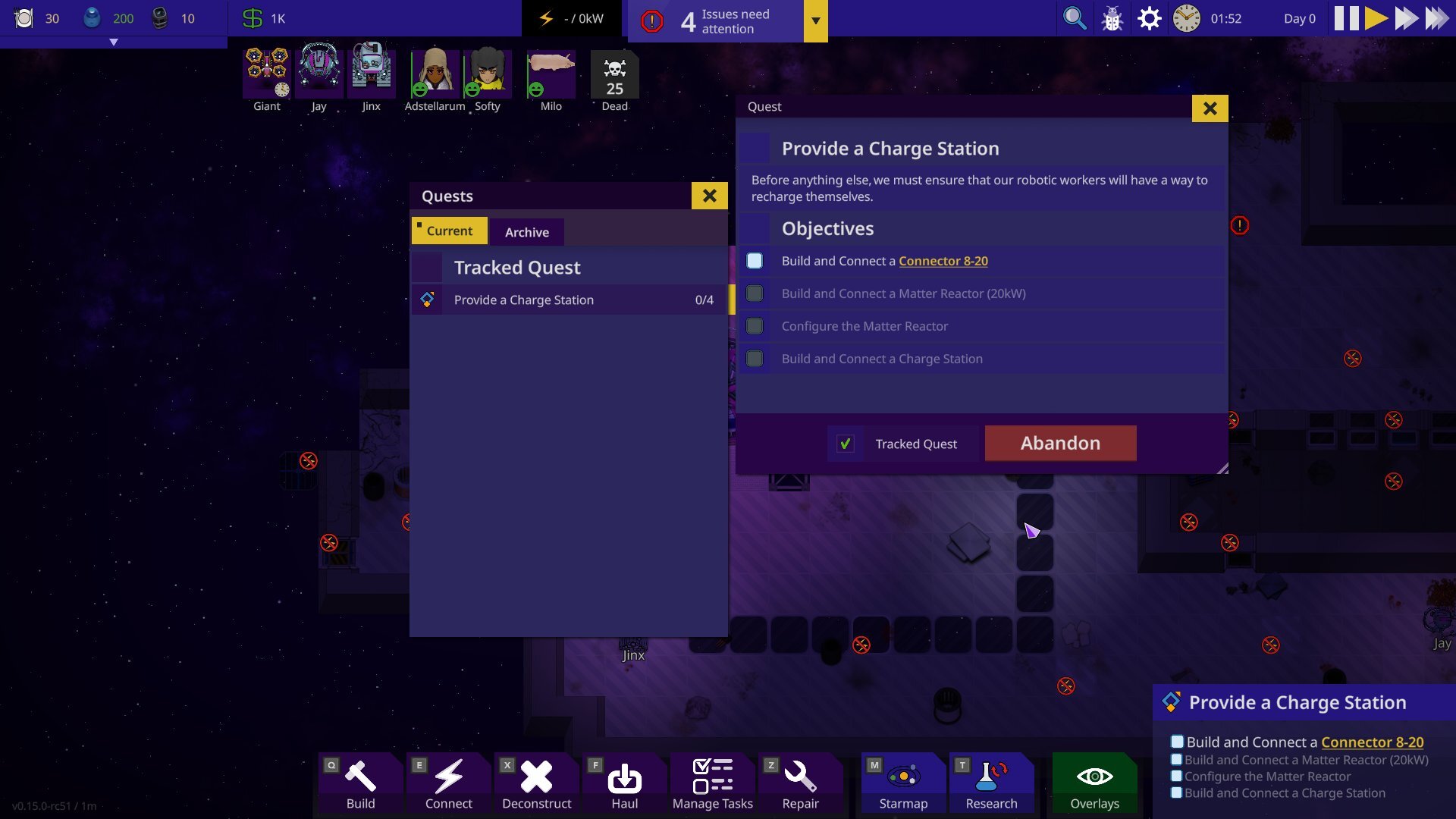 Previously tracked quests were together in the notifications, but since the notifications have been reworked to the notification hub, quests will have it’s own dedicated widgets.
Quick Search
Before:
 After:
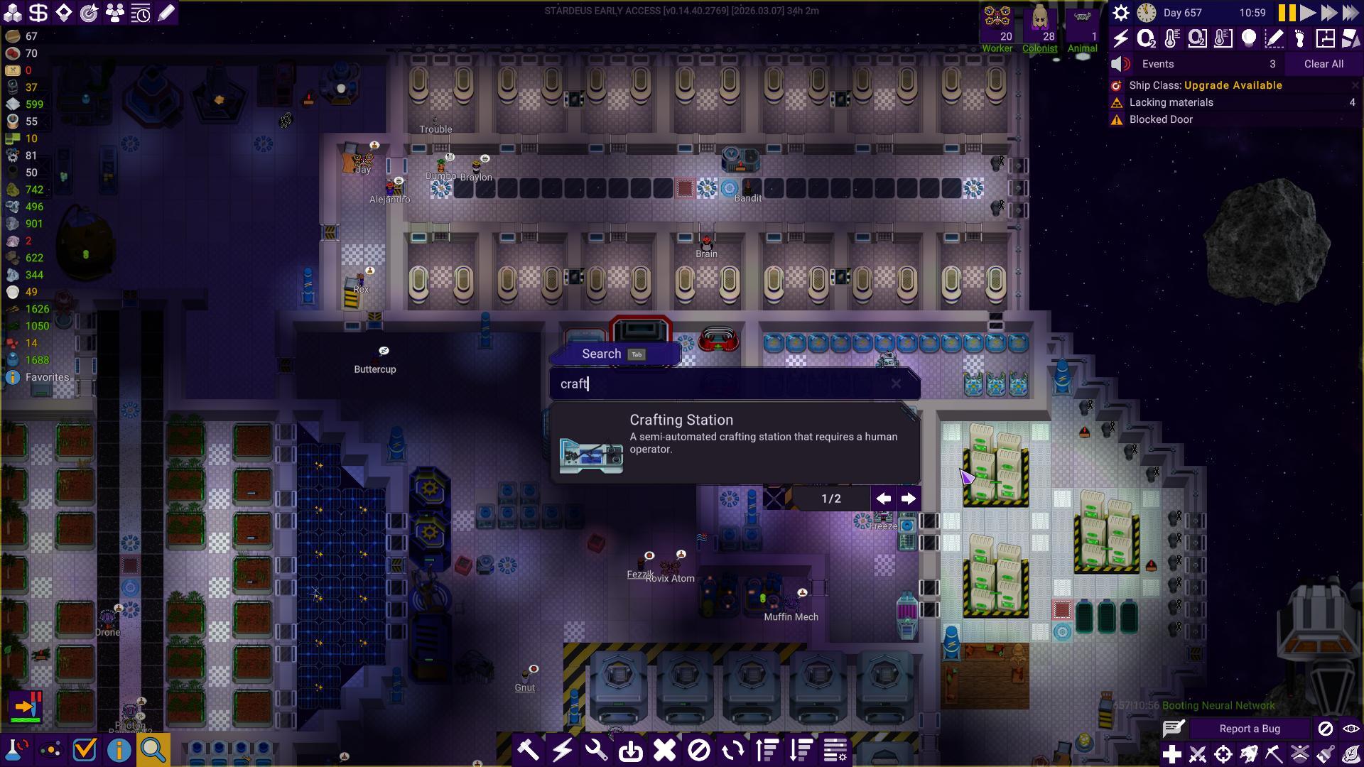
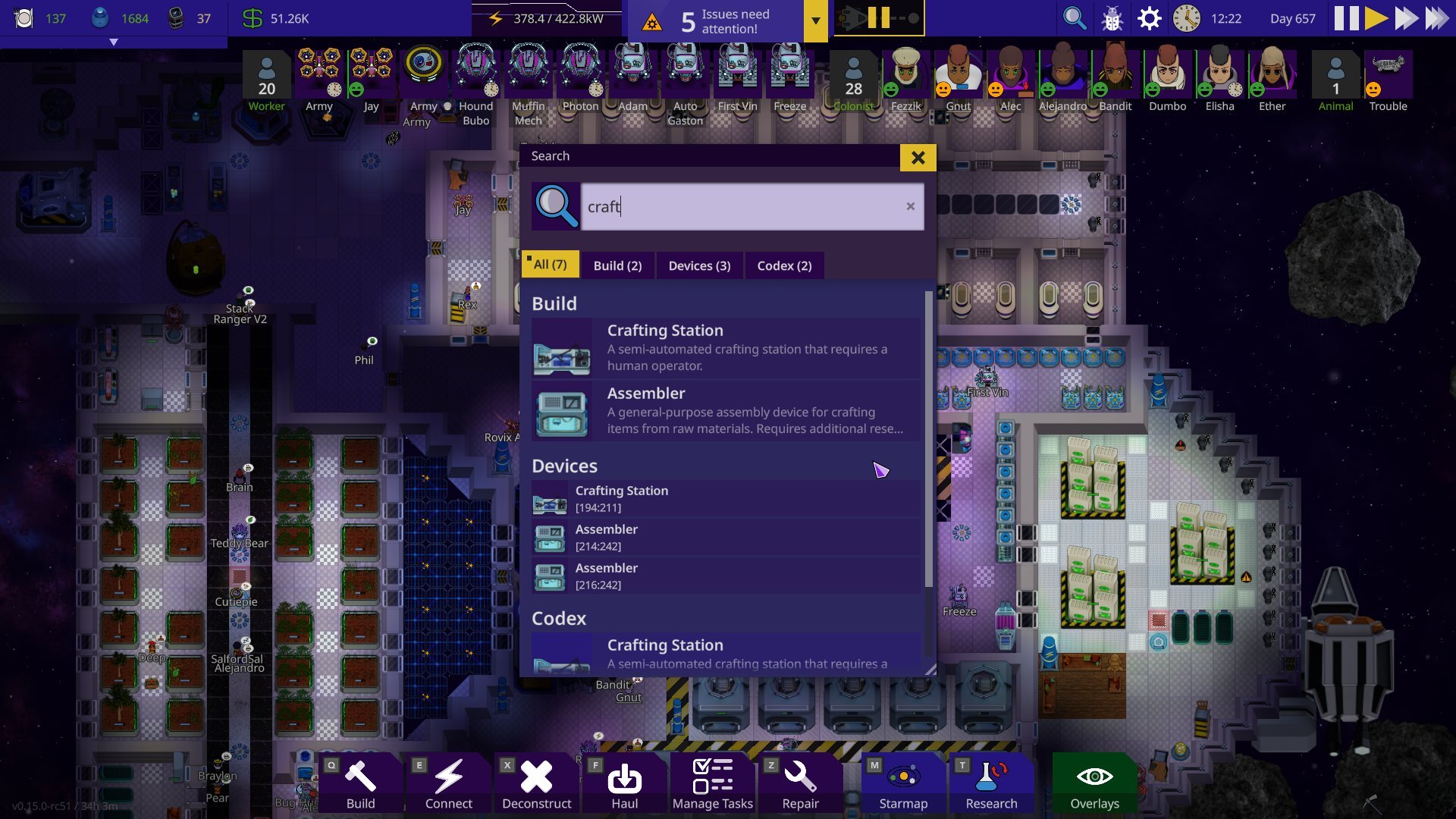 Quick search has become even more powerful. It used to only show the top result and having players to scroll through options until you found what you were looking for. It’s also been sorted into tabs & the old hotbar pinning feature has been moved here as well. Not only that, but it’s also been given a technical overhaul, making it being able to be extended modularly & easier to mod.
Starmap
Before:
 After:
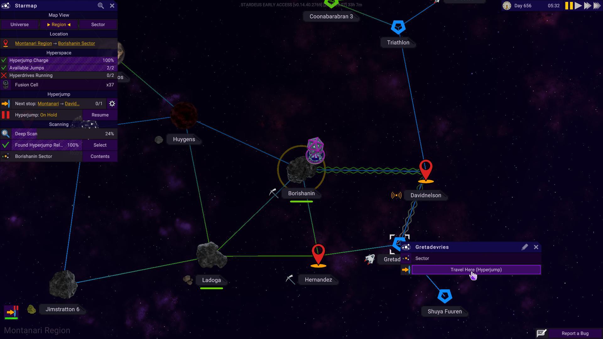
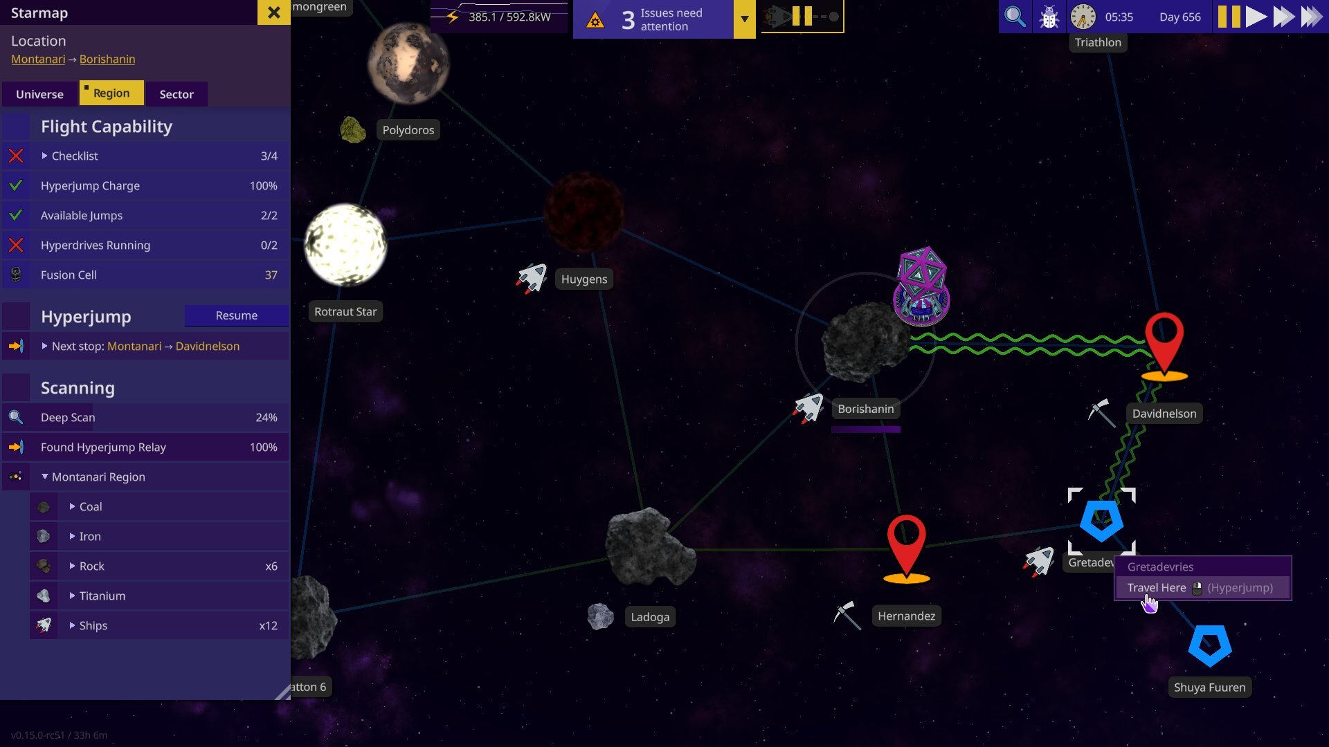 While the Starmap itself hasn’t changed much, the side menu got the full treatment. Tabs & a embedded list of resources known to exist to the player.
Research Tree
Before:
 After:
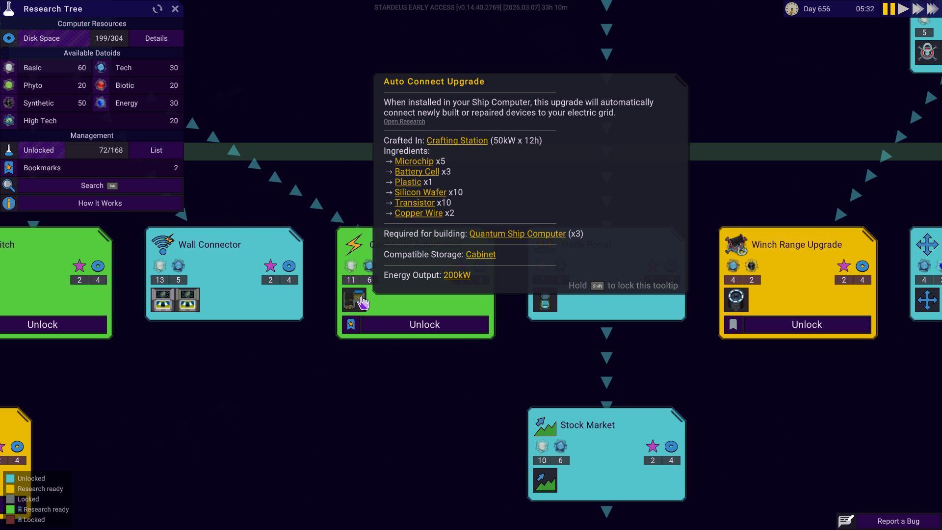
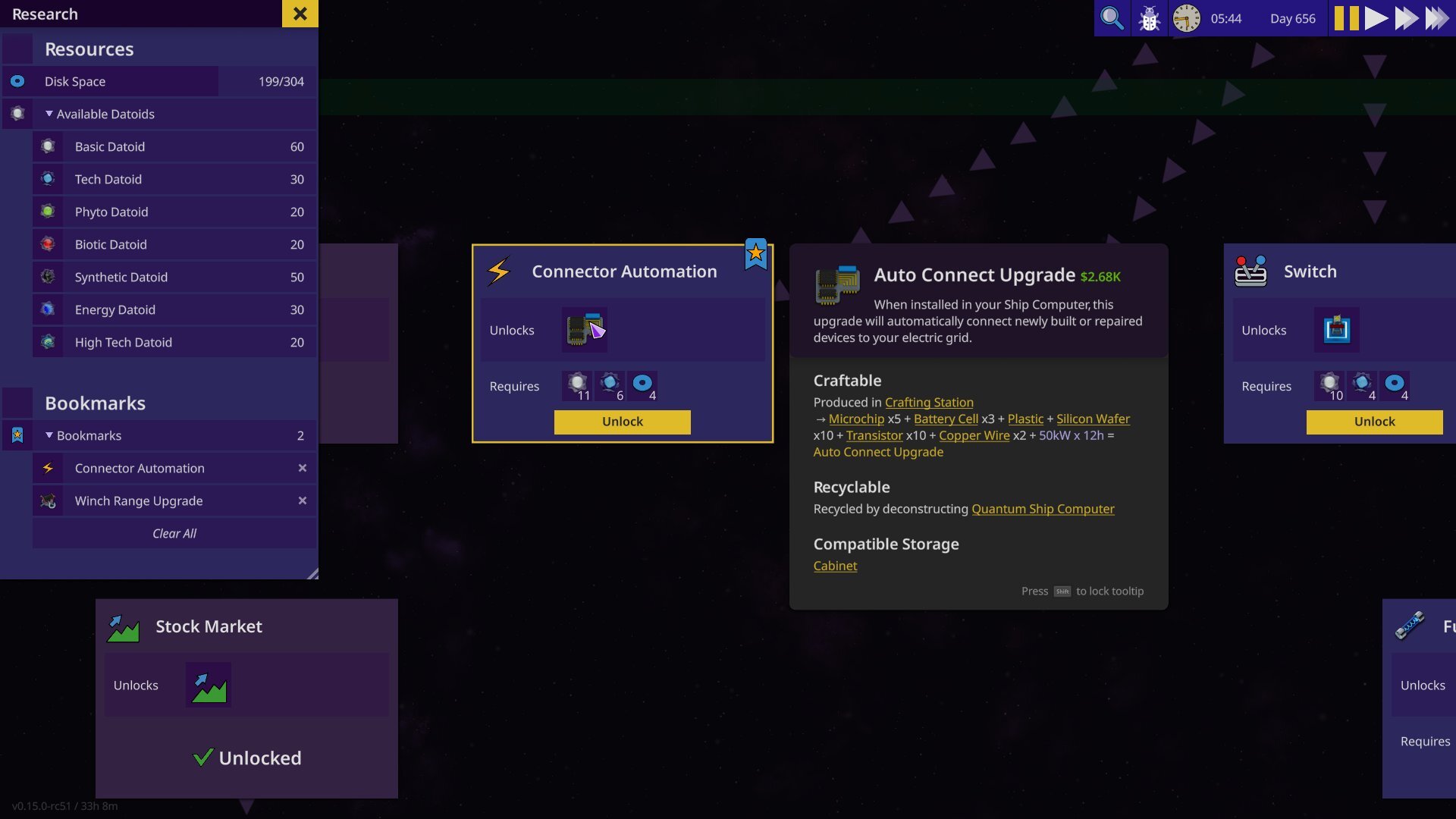 The cards for each research tree have gotten a cleaner and easier to understand look. Codex tooltips have been moved to the side so the card itself isn’t covered.
Build Menu
Before:
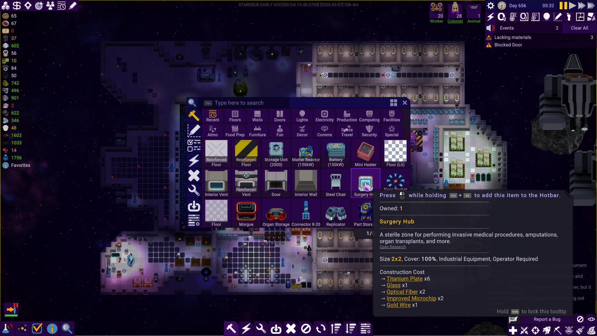 After:
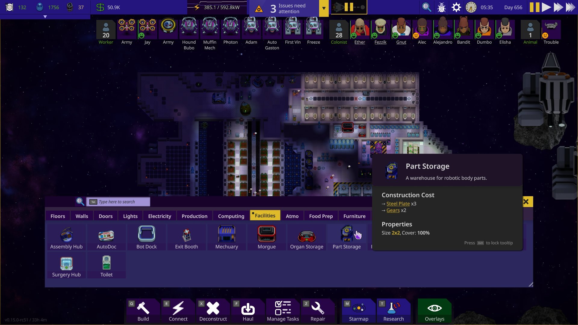 The build menu is no longer a “do it all” menu, and its’ focus has once again returned to building. Sleeker tabs and moved out of the way so you can see where you want to build. It’s also been given a modular design so you can resize and move it (like most in the new UI) into the middle of the screen again, if you so choose.
Planning mode
Before:
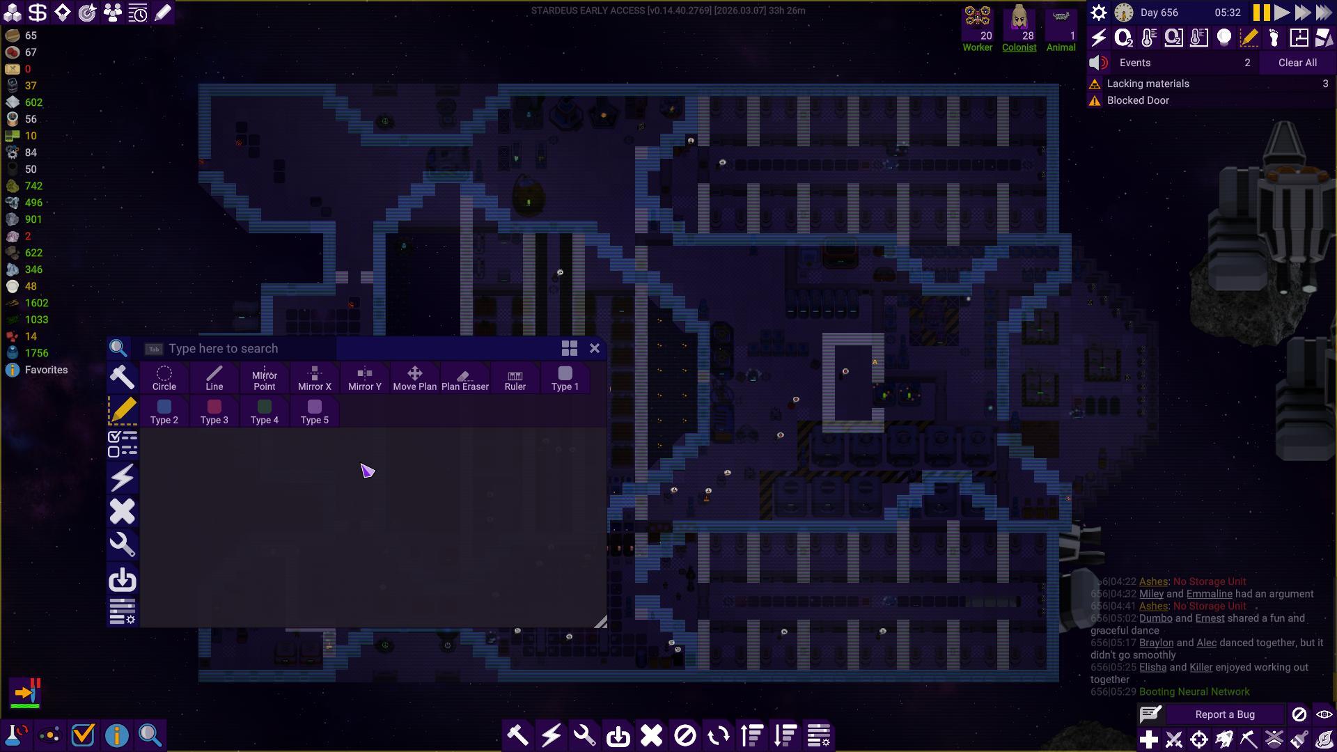 After:
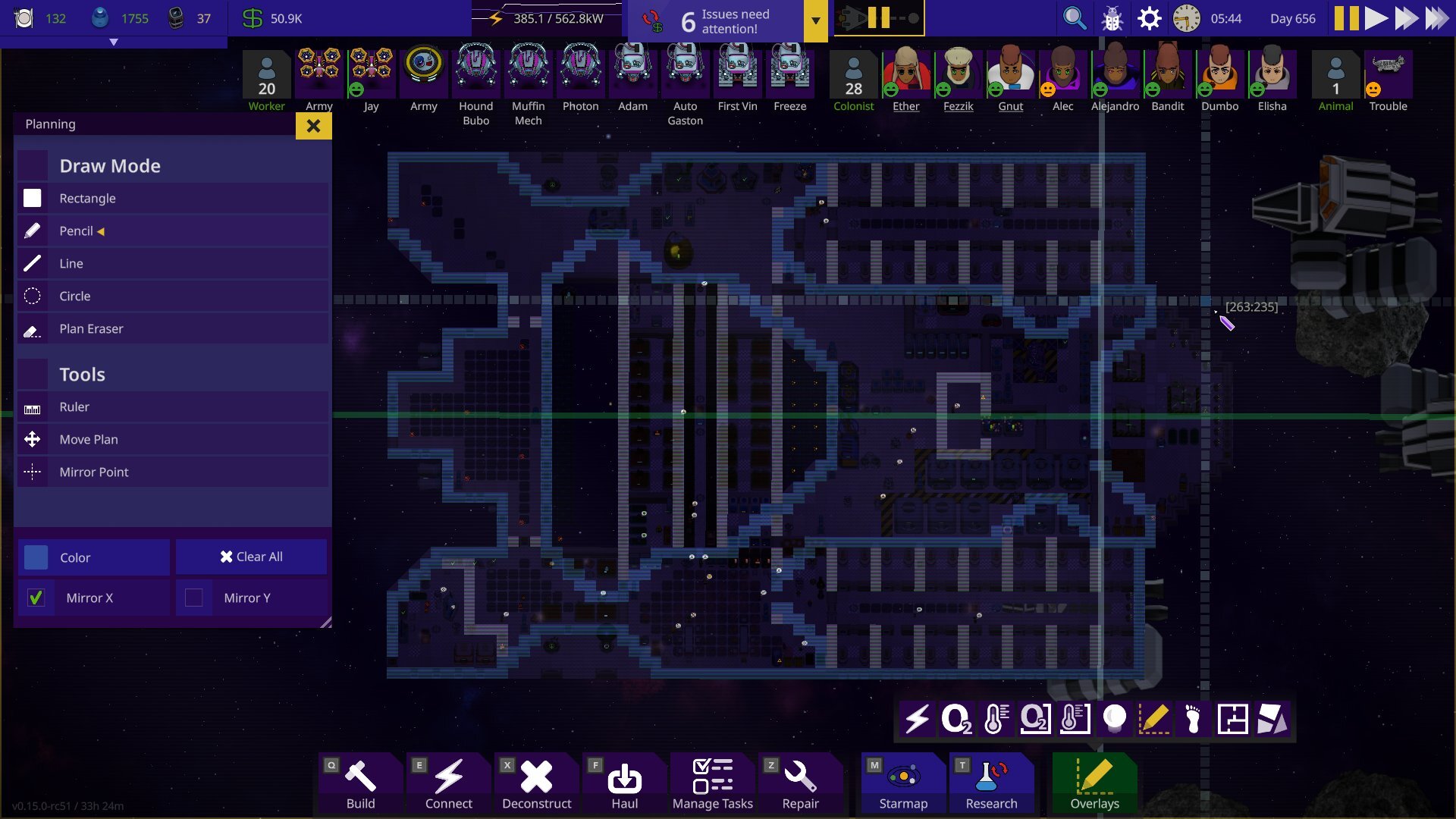 The planning mode now has its own dedicated menu & is much easier to understand.
Multi-selected Objects
Before:
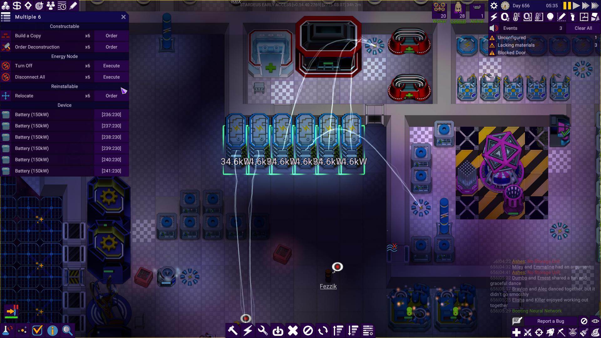 After:
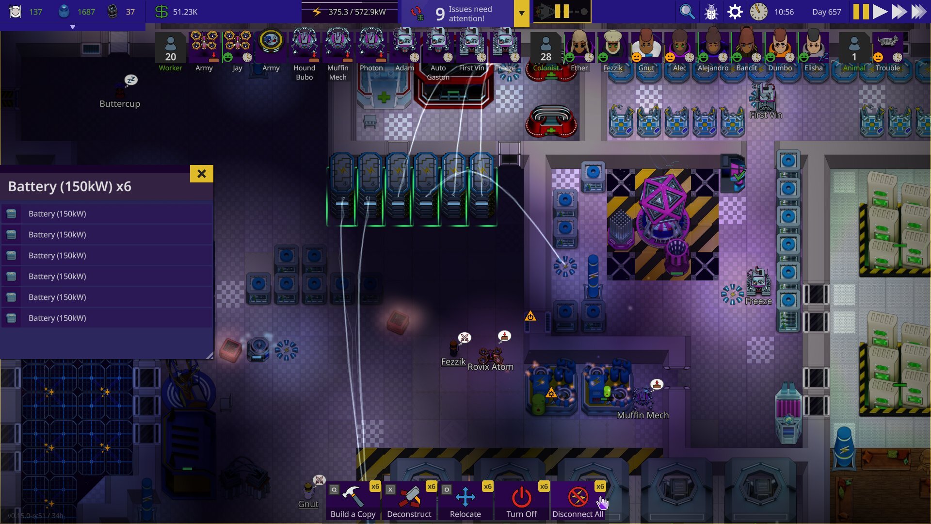 Just like when you select a single object, multiple objects will show the shared actions you can perform in the bottom row.
Expeditions
Before:
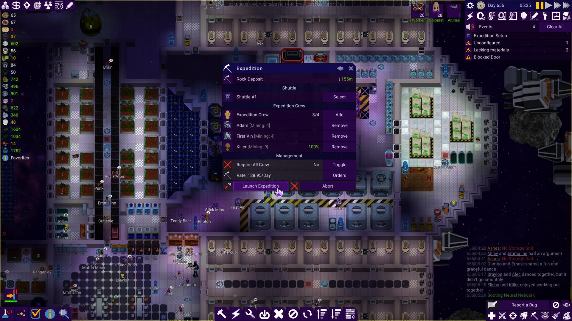 After:
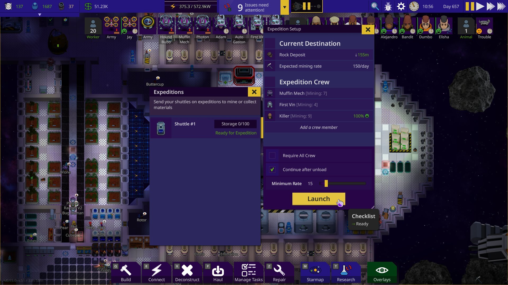 The Expeditions UI is more intuitive and doesn’t require as many clicks as before to send a crew off. Because of how the old UI was designed, players used to miss the extra controls which were hidden behind the “orders” button. Now they’re always visible in the footer of the expedition setup window.
New Game: Crew Configuration
Before:
 After:
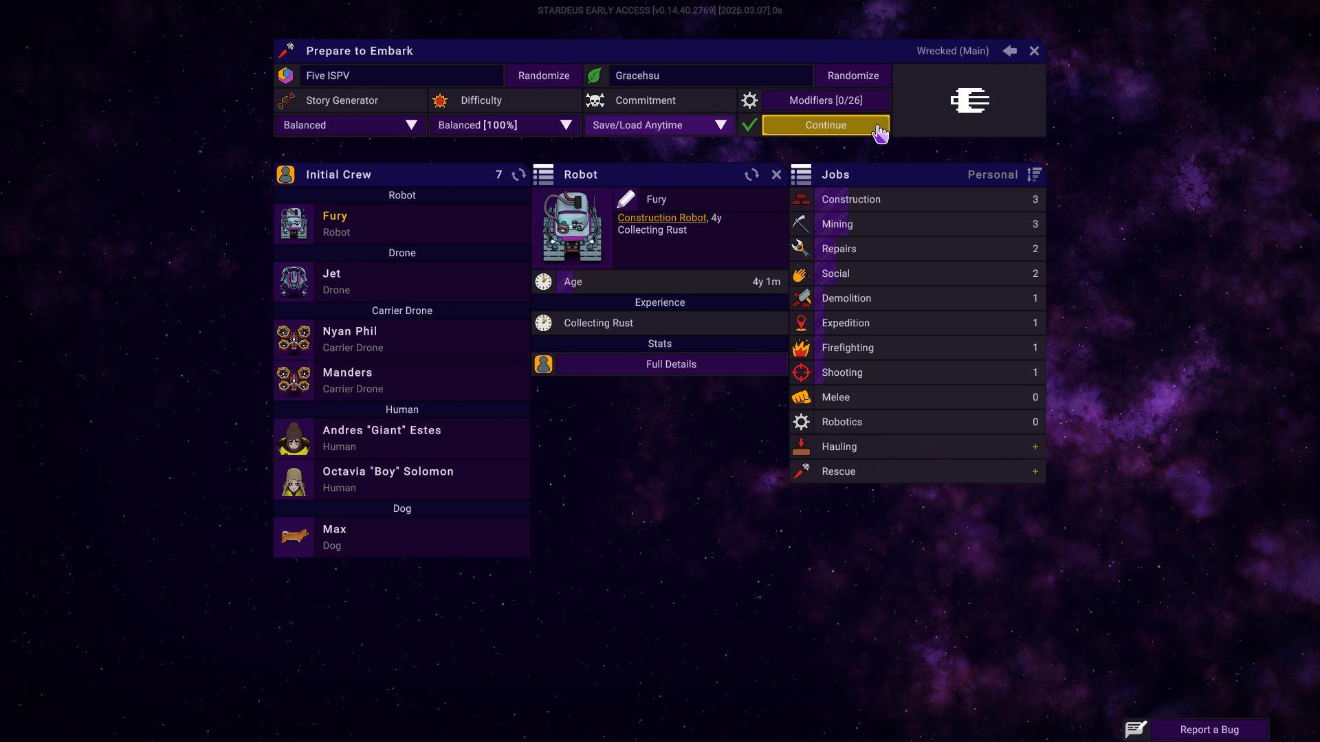
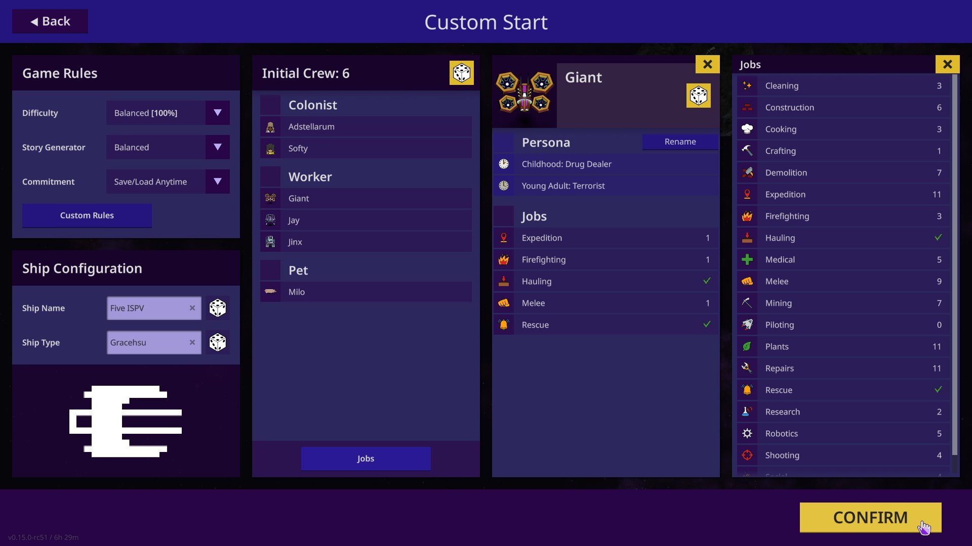 No more wasted space (pun not intended) in the config screen.
New Game: Universe Setup
Before:
 After:
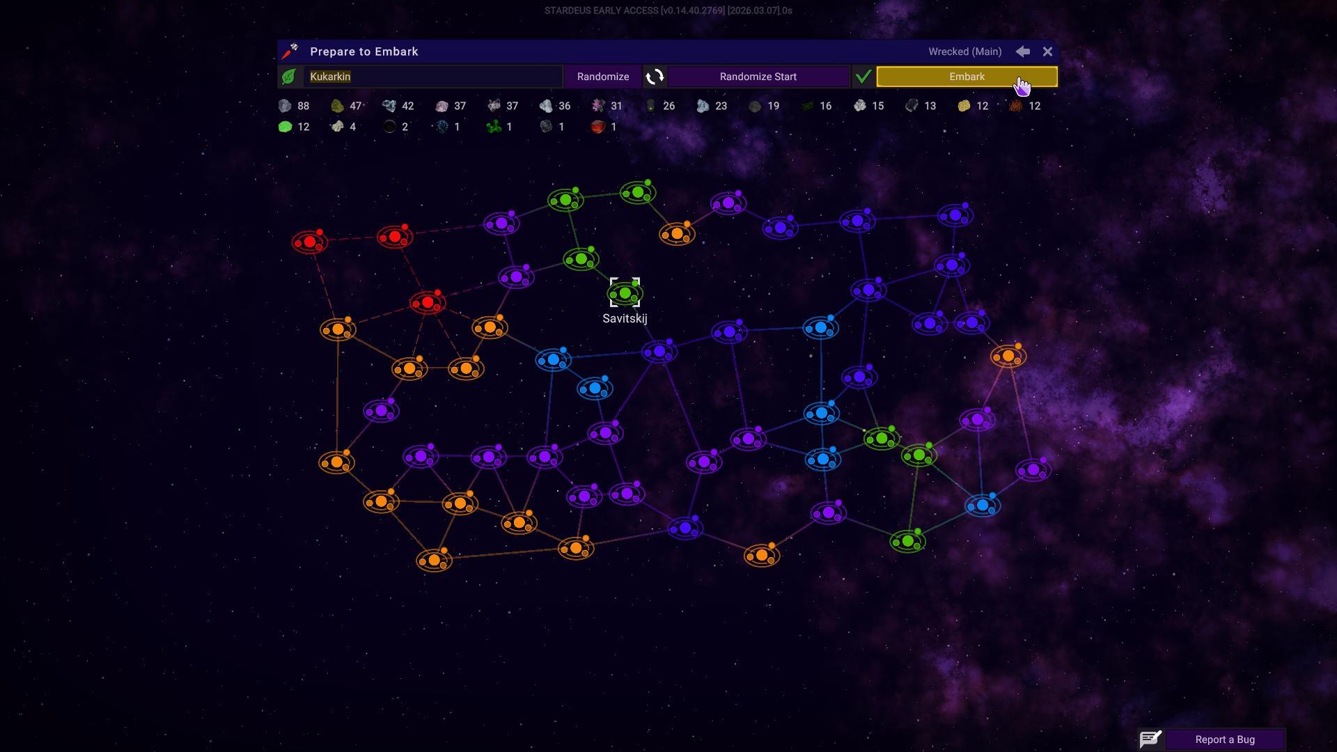
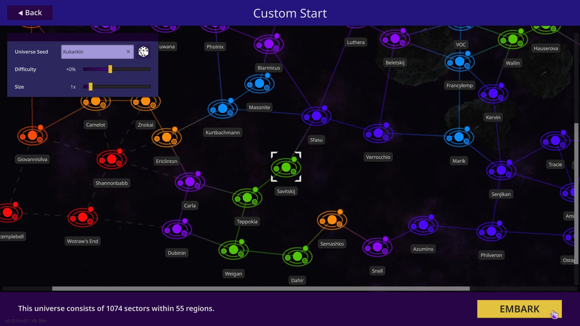 The old universe selection was confusing. The resources at the top showed resources for the entire universe, while some people thought it was the selected region. Deep scanning later in the playthrough would also reveal tons of additional resources which were not listed there, so it’s been removed. Additionally, you can now customise your run even further by tweaking the overall difficulty and size of the universe here.
Post-photos-thoughts
There’s a lot more UI that still need to be reworked, but hopefully this will calm your nerves about the direction we’ve taken. We’re hoping to start public playtesting of the new UI sometime in the near future, probably around 1-2 months but it all depends on the progress.
Thanks for the patience you’ve during this time, we think it will be worth the wait.
// Spajus & Lizz the community manager
Follow the Development
Official Website: https://stardeusgame.com
/r/stardeus on Reddit
@StardeusGame on Twitter
@dev_spajus on Twitter
@KodoLinija on YouTube (devlogs)
dev_spajus on Twitch (live development streams)
Get Stardeus
[dynamiclink href="https://store.steampowered.com/app/1380910/Stardeus/"]